
I started the production stage of the project by reviewing my concept and highlighting information relevant to the outcomes form and aesthetics.
CONCEPT INFORMATION
- Size - needs to be portable.
- Referance guide - content needs to be easy to navigate.
- Designs for creatives - needs to be aesthetically engaging.
- Will be used regularly - outcome needs to be durable.
With the above considerations in mind I started to generate some quick concept variations which explore my initial ideas regarding the form and function of the outcome.
CONCEPT VARIATIONS

- When generating the ideas I tried to think of a diverse range of outcomes so that I had a broad choice of possible products to choose from.
- Having a choice of outcomes enables me to critique each one to find the most appropriate form.
- Due to the considerations set by my initial concept the ideas generated all had similar features, such as they all shared a similar form of a small, portable publication.
OUTCOME IDEA 1
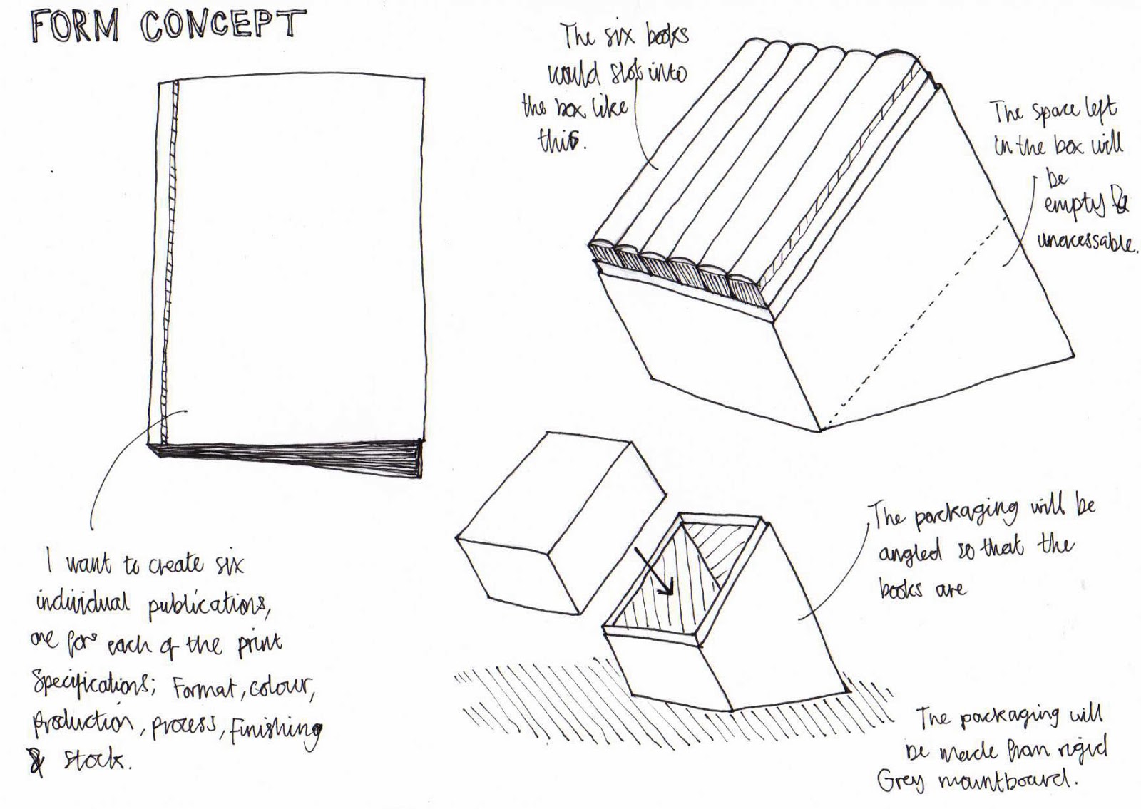
- This concept designates an individual booklet for each of the six print specifications; format, colour, production, process, finishing and stock.
- Each book will act as a reference guide for a part of the print process, this allows the designer to remove a book with specific information relating to what ever stage they are at.
- Singular books allow the user to to easily navigate content.
- The books would be around A6 in size so that they are easy to carry round or keep on your person while working in the print studio.
- I will also create packaging as part of my outcome which will serve two main functions;
- The first is to protect the publications from ware and tare, dirt or excess ink that could be lying round the print studio.
- The second function relates to access and presentation, the packaging has been specially designed so that the books are angled allowing the user to read the spine and remove the book with ease.
OUTCOME IDEA 2

- This concept revolves around the form of a 'Pantone Formula Guide', the guides are regularly used within the design and print industry to help designers communicate their colour choices accurately to the printer.
- As the guides are regularly used within the creative industry my target audience will be able to relate and recognize the form of my guide to the Pantone one.
- My outcome will be wider than the conventional Pantone guide to help ensure that I can fit in all the content. Despite this the guide will still be at a size that is easy to fit into a pocket or bag.
- The outcome will also have rounded corners to improve its durability, uncut sharp corners will bend and become frayed when regularly carried round in a pocket or bag.
- Its small size means that it answers all of the considerations set out by my initial concept.
- I have also considered producing packaging to hold the guide when not in use.
- The outcome will also utilize an elasticated fabric band to hold all the pages neatly together when not in use.
CONCLUSION
I decided to choose idea two as my chosen concept as the form of the outcome allows it to be portable, and yet feature all relevant content in one outcome. Furthermore, its small size will allowing users to carry the outcome around with them, acting as a quick reference guide for the various stages of the print process.
IDEA DEVELOPMENT
After defining the form of the outcome I started exploring the dimensions and function in more detail which allowed me to highlight negative aspects of the design.

- I will need to design the outcome so that the user turns the page to the left as this leaves the optimum amount of page space for any content. If the user opens the guide to the right the bottom of the page coluld cover important information.

- In this diagram I focused on the navigation and function of the outcome.
- To help with navigation I plan to use the same thick stock used for the cover and bottom of the design for the title pages. The thicker stock will create a contrast to the pages of the outcome allowing designers to easily distinguish between the different chapters.
- For my primary visual research I looked at the 'Pantone Formula Guide' to assess the success of its form, one problem I highlighted was the fact that the guide fans open really easily as there is nothing to hold the pages together. Therefore, to help improve the function of the outcome I have decided to utilize an elasticated fabric band that will hold the outcomes pages together when not in use.

- The image above shows the exact dimensions the final outcome will have.
- Working out the position of the binding screw and covered area early on in the production process will save me time when setting up my Indesign document and also allows me to see the exact amount of page space available to work with.
DESIGN DECISIONS
After defining the specifics relating to the form of my outcome I was at a stage of the production process where I could start making decisions regarding the aesthetic elements of my outcome.
- Typefaces
- Colour
- Stocks
- Binding method.
TYPEFACES
When selecting my typefaces I analysed their relevance with regards to the three points below.
- Legibility and readability (various sizes).
- Clear hierarchy (helps navigation).
- Aesthetic compatibility.


CHOSEN TYPEFACES
Below are my initial choices for both the header sub header and body copy font.
Header font - Octin Sports.

Subheading font - Courier New (Bold)

Body copy font - Courier New

Mixing the fonts.
Once I had selected the three fonts I created a mock layout in Indesign which enabled me to see how well the three fonts mixed together, and if the typeface hierarchy was clear.

ANALYSIS
RESPONSE.
In response to the results from the mixing experiment I decided to select a new primary font, I reviewed the choices initially made and selected a font with....

Printed font size.
Different fonts will look different when they are printed due to variations regarding x-height and tracking. The form of my outcome is going to be relatively small reflecting the form of a pantone guide. Therefore the outcome will need to utilize my chosen fonts at a small size to ensure that I get the most out of my already limited composition. Therefore, I decided to produce some primary type experiments to help me define what the smallest legible text size is for my body copy font.


- You can see it too well in the photograph but the 4pt text is still legible to a certain extent.
- The 5pt text is clearly legible but you still have to strain your eyes to read it from a distance.
- The 6pt type is also clearly legible and seems to be the optimum size for the body copy in my outcome. As I am working with unusual page dimensions I need a small font to ensure that I can fit all of the relevant content on each page.
- The Pantone formula guide I looked at in my research used a similar sized font for its content.
COLOUR SCHEME

STOCKS
I started my search for the appropriate stick by visiting the library to see what stock choices they have available.

- Relatively thick white card with a smooth matt finish, would be perfect for the pages of my outcome however I want to use an off white coloured paper so that it creates a relatively soft contrast to the black aesthetics of the outcome.

- For the cover, bottom and title pages I want to use a thick black card stock so that the guide is rigid and not floppy like the Pantone formula guides. Unfortunately, the black card stock available in the library is way to thin to achieve the desired functionality.

- More suited are the thick card mountboard stocks, however their aesthetic appearance is far from what I imagined. The mountboards are simply card with a paper coating on either side, although similar to what I need the black mountboard available has a white coating on its reverse side which makes it unsuitable.

- The antique white paper has a tactile textured feel and is slightly off white in colour. I want a similar stock for the pages of my outcome, however the paper used need to have a higher gsm as this paper is not rigid enough.
Main stock - Thick 200+ gsm off white paper.
Cover & Divider stock - Black mountboard.
ORDERING PAPER
Before ordering my paper I worked out what sheet size would be most economic to print my outcome on, this will help me save money and prevent an unneeded excess of waste paper. Making decisions regarding sustainability is important to my design practice as an ethically driven designer.
I created a template with the same dimensions as the page size of my outcome with an added 3mm bleed. Next, I tessellated the design to find out what size of paper fits the optimum amount of faces on a single side. Due to the form of my outcome I do not require double sided printing, therefore I do not have to worry about designs aligning with a reverse print.
A2 -

A3 -

Of the two paper sizes it is more economical to print using an A2 sized sheet, to print 100 pages of my outcome on A3 stock would require 20 A3 sheets, whereas to print the same amount of pages on A2 would only require just over 9. Although this means there is little difference between the two sheet sizes in regards to paper useage, the real difference is in the cost.
To buy a 10 sheet pack of A2 recycled paper only costs £12.16, however to buy 25 sheets (set sheet amount) of recycled A3 paper would cost over £30. Therefore, I ordered the A2 sized paper, using the page layout shown above this will allow me to print 110 pages of my outcome.


BINDING METHOD
In my primary research I looked at a physical example of a Pantone Formula Guide, reviewing the stocks, production and binding methods used to create it. Critiquing the guide allowed me to see its flaws and create a response that surpasses these mistakes.
The overall production of the guide was of a relatively high standard. Firstly, it is easy to navigate, its form is functional its content is well organised, an aspect that helps the guide achieve this functionality is the binding method used.
The selected method consists of a single plastic binding screw which has been placed through the bottom left hand corner of the guide, this allows users to open the guide in either direction, opening it page by page or in a fan fashion.

- Although I have outlined my binding method I cannot order the screws until I have finished the printing stage of my outcome. The screws work on a length basis so the thickness of my guide needs to be accurately measured before the correct length of screw can be ordered.
- I am working to a tight timeline with this particular project, therefore I have considered guessing the thickness of my guide and ordering screws that could possibly be too long. To overcome the problem of the screw being too long I would simply cut a length off the receiving post.
Once I had finalised all of my design decisions I ordered the 270gsm recycled stock mentioned above. I ordered the stock while still in the thumbnail design stage of the project to ensure that it would arrive in time for production and printing.

I wanted to order the binding screw at the same time as the stock to ensure all materials are delivered in time for the outcomes production and submission. However, before ordering the biding screw I needed to first needed know the thickness of my outcome. Unfortunately, it was not possible to know this information until the end stages of the production process. Therefore, I had to wait until all pages had been cut out, stacked and measured before ordering the binding screw.

CONTENT ORGANISATION
Before progressing with the digital design of the outcome I needed to refine and organise the information that will form the content of the guide. As the outcome is being designed as a reference guide for the print process it needs to include detailed information on how each of the six areas can be successfully completed. Therefore, I went through my research and analysed the content, forming a list of the most important areas of the print process that are essential to its completion.
Writing the content was a serious time killer, coming to just under 9,000 words it took me almost a week to write and has seriously affected my initial time scale. In future projects I need to plan in extra time for written aspects of work to avoid this kind of costly mistake.

Content organisation link - LINK
THUMBNAIL DESIGNS
After defining all of the design decisions and organising the content of the outcome I started designing thumbnail layouts for the pages of the booklet.
Instead of designing individual layouts for each page I instead designed a set of page compositions that can then be consistently used throughout the publication. Using set layouts helped me save time when drawing the thumbnails and created a consistent layout theme that runs throughout the outcome. Moreover, separate sheets were created for special pages that contained tables and large illustrations.


COVER THUMBNAILS
Below are some thumbnail variations exploring some different cover designs. The cover will be printed onto a thick card stock to ensure that it protects the guide from ware and keeps it sturdy. Additionally, the graphic will be printed using a spot varnish or clear foiling to keep a clean, minimal aesthetic.


TITLE PAGES
Title pages will also be printed on a thicker stock to allow the user to quickly navigate through chapters. To keep a consistent theme running throughout the outcome I will also print the pages using the same technique applied to the cover.


TIME MANAGEMENT
The project is running alongside around seven other briefs, and therefore I am working to a very tight timescale. To ensure that the project stays organised and on time I created 'time management sheets' to help me keep on top of the various projects.

DIGITAL PRODUCTION
I used the dimensions outlined earlier in the project when setting up the document and estimated that the booklet would be around 70 pages long.

ILLUSTRATIONS
I used Adobe Illustrator to create all the illustrations for the guide to save time. As I was working on such a tight timescale I used no initial sketches and instead created icons and illustrations by combing and subtracting shapes using the pathfinder tool.


A white overlay with the opacity adjusted was used to highlight the different colour combinations.


Illustration communicating the workings of a lithograph printer.
One thing that was mentioned in the final print critique was the irregular line spacing on some pages, as I have used a justified text setting on InDesign the spacing between words is automatically set by the program, this can sometimes leave large spaces that can affect the readability of a passage of text. To overcome this problem I went through each passage of text as it was added to the document, changing the tracking between letters to change the width of individual words.

PRINTING
Before I could digitally print the pages of the outcome I needed to organise the individual pages onto A2 sheets in the arrangement previously created in the development stages of the project. The idea behind this was to prevent an excess of unused paper and to lower the cost of printing. Due to the form of the outcome the pages only need to be printed on one side, therefore there will be no alignment issues.

As well as digitally printed pages my guide also featured print examples that act as a way of showcasing a physical example of the specified print method. To display the varying methods I created a pattern to act as a consistent visual prop. Then, created the example by applying the different print methods. Utilizing the same pattern for each print method allows the user to see the specific differences and benefits between the featured print methods.
Mono-print


TRIMMING
The trimming stage of the project was completed using a metal ruler and scalpel, the process was very time consuming however quite exciting as I could see the guide finally coming together.


The finished pile of pages ready for the addition of the cover and dividing pages.

CORNER CUTTING
As outlined in the development stages of the project I decided to round the corners of the guide to improve its durability and create an aesthetic likeness to a Pantone colour guide. To round the corners I specially purchased a 1-cm corner rounder from the internet.


DIY EDGE PAINTING
As outlined in the development stages of the brief I wanted the edges of the outcome to be painted black. When collecting research for the project I came across a way of replicating the effect using a DIY technique that uses a ratchet clamp and spray paint.

Before I applied the clamp I sandwiched the pages of the outcome between two pieces of corrugated cardboard and aligned the pages ensuring that they were completely straight. Once aligned I placed a piece of old wood at the top and bottom of the arrangement to disperse the pressure of the clamp.

Next, using a hand clamp purchased from the internet I applied as much pressure as I could to the arrangement and then applied the spray paint (this step was completed outside).


The end result.
BINDING
Before I could bind the booklet I had to first puncture a 5mm diameter hole for the post of the binding screw, this was a lengthy process as a hole needed punching through the corner of each page. To accurately complete this stage of the guide production I used my hand held hole-punch starting with the thick cover page. Once complete I used the cover as a template to ensure that the hole was punched into the exact same position on each page.


No comments:
Post a Comment