
COMPETITION INFORMATION
The secret 7” design competition is an annually held event
that allows creatives to create a design for a special, one-off vinyl sleeve.
Participants have a selection of musicians and bands to choose from, all of
which usually span a variety of music genres and ages. A selection of winners
are selected for each musician with the sleeves being printed and displayed in
an exhibition in London.
The brief is fairly open and allows participants to take any approach they see relevant to the sleeves design and production, this is a good aspect of the competition as it allows me to create a response that is relevant to my design practice.
Due to the amount of work I am currently balancing I set myself a very tight timescale of one day, giving me only a number of hours to complete the project. By working to such a tight timescale I will have to move through aspects of the project quickly to ensure that everything is completed on time. However, despite the challenge this is very beneficial as it will help to improve my organisational skills.

TIME MANAGEMENT
As I am working to such a tight timescale with the project I first created a day plan to help me consistently progress through the various stages of the project.

ARTIST SELECTION
After organising the project and defining a day plan I started to progress with the project by reviewing this years selection of artists.
I took time to listen to each track available on the Secret7" website and then selected four tracks that could become the focus of my project. When listening to the songs I payed attention to the lyrics and moods portrayed to see if any ideas jumped out at me.
REFINED CHOICES;


POSSIBLE ARTIST CHOICES;
- Jake Bugg - Strange Creatures.
- Massive Attack - Karmacoma.
- T-Rex - Get it on.
- Elbow - Grounds For Divorce.
FINAL CHOICE;
After reviewing each song again I made my artist choice based on which track was my favourite. Despite not being interested in any of the featured artists I found Elbow's song "Grounds For Divorce" sounded the best and had some thought provoking lyrics.
RESEARCH
Once I had defined the artist and song my outcome will represent I progressed with the project by collecting a body of research that anlysed the song to help me generate a set of relevant ideas.
Research Link - Link.
INITIAL IDEAS
After collecting a body of research that analysed the songs lyrics and mood I felt informed enough with the messages communicated to start progressing through the ideas generation stages of the project.

POSSIBLE PROJECT DIRECTIONS;
- Focus outcome on alcoholic beverage - pint or cocktail.
- Using alcohol as a form of escape.
- Escaping from problems - droplet escaping from print.
FINAL IDEA
ALCOHOL AS A FORM OF ESCAPEI decided to base my concept for the vinyl sleeve around using alcohol as a way to escape from problems that arise in everyday life. While assessing the songs video and lyrics alcoholism appeared to be a definitive theme and so will form a relevant focus for my outcome.
To capture the feelings emoted by the song I plan to utilise a dull or monotone colour scheme that relates to the often depressing life of an alcoholic. Visually contrasting this, the pint or cocktail featured on the design will be rendered in bright appealing colours to relate ideology that alcohol can be used as a form of escape.

DESIGN DECISIONS
Before progressing with the design stages of the project I first defined my design decisions relevant to the outcomes digital production. As the outcome will feature no typography decisions regarding fonts need not be considered.
COLOUR SCHEME;

INITIAL DESIGNS
After defining my final idea I progressed with the project by creating a quick range of thumbnail designs exploring how the vinyl sleeve could look. As I gave myself a day to complete the project I moved through the thumbnail design stage of the project very quickly. Although this allowed me to progress with the design of the final outcome the quality of the designs was very poor.


CHOSEN DESIGN;
Once I had create a range of initial designs I reviewed each one taking into consideration its relevance to my analysis of the song lyrics and moods emoted by the song. As a focus of the single revolves around using alcoholism as a form of escape the first hand view designs of a bar scene seemed to be the most relevant and effective concept.

DESIGN PRODUCTION
After outlining a final design I progressed with the project by creating the base illustration for the vinyl sleeve. When creating the illustration I used the primary images collected from my visit to the pub as a reference to ensure my design accurately depicted a pub scene.

Once the initial pencil work had been completed I progressed with the base illustrations production by adding the pen layers and detail.
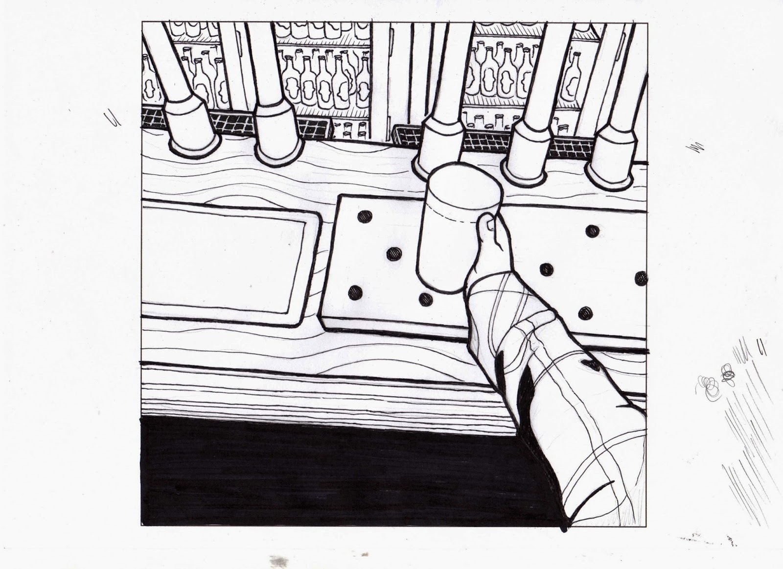
The image below displays the final hand-rendered illustration.

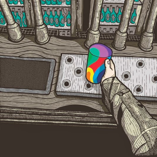
DIGITAL DEVELOPMENT

Vectorised illustration.

After vectorising the base illustration in Adobe Illustrator I moved the line-work into a new Photoshop document ready for the colouring process. After my success with colouring the Boardpusher illustration in Photoshop I decided to utilise the program again to render my outcome.

DIGITAL COLOURING PROCESS;


FINAL DESIGN
The images below document the final design finished and ready for submission.

The proposal image displayed below was not submitted to the competition but is instead featured on my online portfolio websites where the project is blogged.

SUBMISSION
After completing the illustration I double checked the submission detailed reviewed in my research to ensure my entry would be submitted problem free. Once I was happy my design complied with the competition rules I submitted the outcome on the Secret7" website.


No comments:
Post a Comment