
WRITING THE BRIEF
(scan in brief)
RESEARCH
Once I had written an informed brief for the project I progressed with the most important part, collecting a body of informed and relevant research into my chosen subject matter.
As my subject matter is secretive and could be classed as a conspiracy theory of some sort the success of the project relies on the quality and depth of my research to help both me and the audience understand its specifics. Therefore, I devoted a huge amount of my time to collecting a body of relevant research, links to which can be found below.
Research Link - Link
Research Link - Link
Research Link - Link
CONCEPTS
After collecting a body of extensive, informed research I felt knowledgeable enough with regards to the subject matter to start creating concepts and ideas for the booklet. When doing so I referred back to my research so that I could make project decisions relevant to the subject matter to help form a booklet relevant to the content contained within.


DESIGN DECISIONS
After completing the initial stages of the project and generating some concept ideas I progressed with defining the project design decisions. When doing so I referred back to aspects of my research to ensure that the decisions are relevant to the information featured in the booklet. By defining aesthetic decisions that have relevance to the content featured the booklet will have a relevant visual theme that forms a cohesive combination with information and supporting visuals.
COLOUR SCHEME
The colour scheme was kept simple and consists of two main colours with additional tints. The off black colour has relevance to the occult nature of Alchemy, a subject synonymous with ORMUS and an essential part of the subjects history. Moreover, contrasting the dark tones of the black I also included a striking red, the colour has relevance to the project as red is the colour of sulfur, one of the main ingredients used when creating the legendary Philosophers stone. Both colours have relevance to the information communicated within the booklet and will be applied consistently throughout the outcome to form a strong visual outcome.

TYPEFACES
Additionally, I also want the typefaces to have relevance to the subject matter covered within the outcome. When collecting aesthetically focused research for the project a lot of the outcomes utilised old English style fonts to form a visual reference to the historical aspect of ORMUS and Alchemy. However, I wanted to surpass this, applying modern fonts to create a synergy between modern and aged aesthetic decisions. A lot of the information has historical relevance, but the booklet itself is being designed for a modern audience. Therefore I wanted to create a balance between modern and old aesthetics to make the outcome engaging for the audience.
PRIMARY
The primary, display typeface selected as part of the project is called Baron Neue, and was outlined as the main font due to its striking aesthetics and optional alternate letter forms. When researching into ORMUS and Alchemy it became very apparent that symbolism played a big part within the subject. The alternate letter forms available as part of the typeface enabled me to form an aesthetic similarity to the symbols found throughout the research collected for the brief.

SECONDARY
Supporting the main display typeface I chose a font named Courier New to form the body copy of the booklet. As previously mentioned I want to create an aesthetic that balances old and modern aesthetic elements. The majority of graphic illustrations applied within the booklet will have an ages visual theme. Therefore, to create the balance desired I outline a modern typeface for the body copy relevant to the audience outlined as part of the brief.

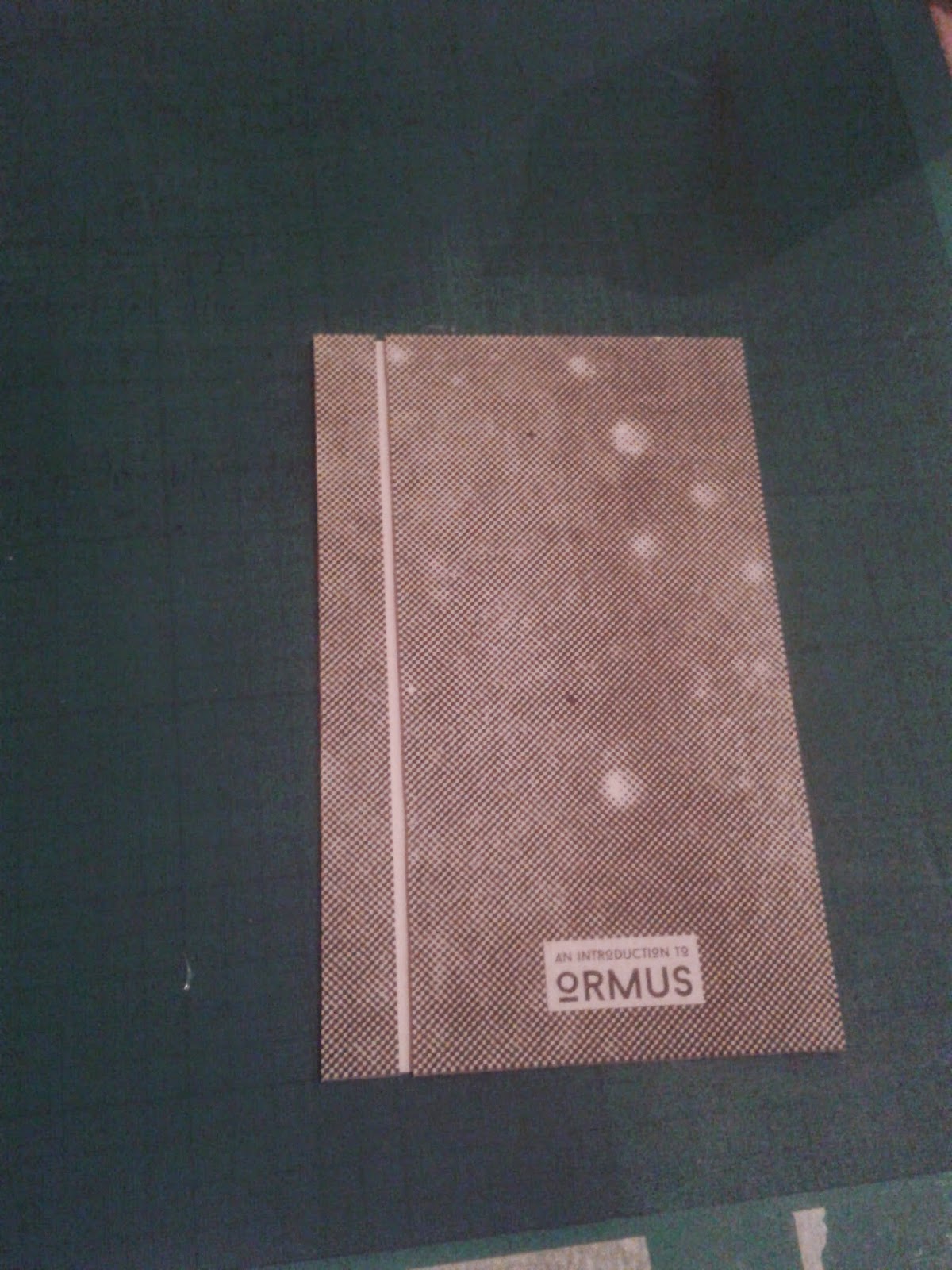
STOCK
The stock selected for the project was essential in creating the desired aged aesthetic. Therefore, when selecting a paper for the project the selection had to have a rough matt surface and off white colour. When printed onto the characteristics of the paper mean that colours will fade slightly creating the aesthetic desired.
STOCK TEST PRINTS
I had previously mentioned when assessing other project that I should create a series of test prints on stocks that could be used as part of the project outcome. Varying stocks have different characteristics which can affect colours and the vibrancy of the print. By creating a series of test prints I was able to select the most appropriate stock and asses its printed qualities.
Grey Sugar paper.

Off white sugar paper

Bulky Newsprint paper

CHOSEN STOCK
From the selection of paper tested I chose to print my outcome onto the off white sugar paper. The stock was of medium weight, had a dark aesthetic and achieved the visual effect desired for the pages of the outcome.
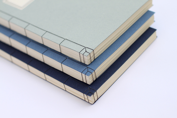
BINDING METHOD
As previously defined as part of my research I want to apply a decorative Japanese book binding method like the one reviewed in my research.
LAYOUTS
After defining the concept and various design decisions I progressed with the project by creating a range of page layouts exploring different page compositions. The process was an essential part of the project as it allowed me to define a final set of layouts that would then form the base of the outcome.
Layouts were created for both the pages of the booklet and the tip-in booklet.
BOOKLET LAYOUTS


TIP-IN BOOKLET LAYOUTS


CONTENT ORGANISATION
Next, once I had completed a series of layouts I created the content for the booklet. As my research was so extensive this was a very time consuming process as information had to be assessed to define the most important aspects. A limitation set by the brief was that we were only allowed to create a 16-page booklet. Therefore, careful consideration had to be given to define what information will be included in the final outcome.
The process was documented on a separate blog post which can be found here - Post Link

ILLUSTRATIONS
Before progressing with the booklets digital production I started the design process by creating a range of illustrations to be applied within the booklet.


DIGITAL PRODUCTION
Once I had the appropriate visual elements I was in a position to start progressing with the booklets digital production. As I had previously outlined a series of layouts and created the majority of the supporting visual elements the digital production process was completed quickly without mistake.
When creating the document a large inside margin was defined as the booklet will utilise a decorative Japanese book binding method previously outlined in the design decision stage of the project.

I decided to use justified text, and so the line spacing was automatically adjusted by Indesign making it unbalanced which consequently affected readability. To overcome this problem I typeset passages of text as I progressed through the booklets design.


Finally, after completing all pages the standard black colour applied throughout the booklet was changes to match the black colour defined in the design decision stages of the project.

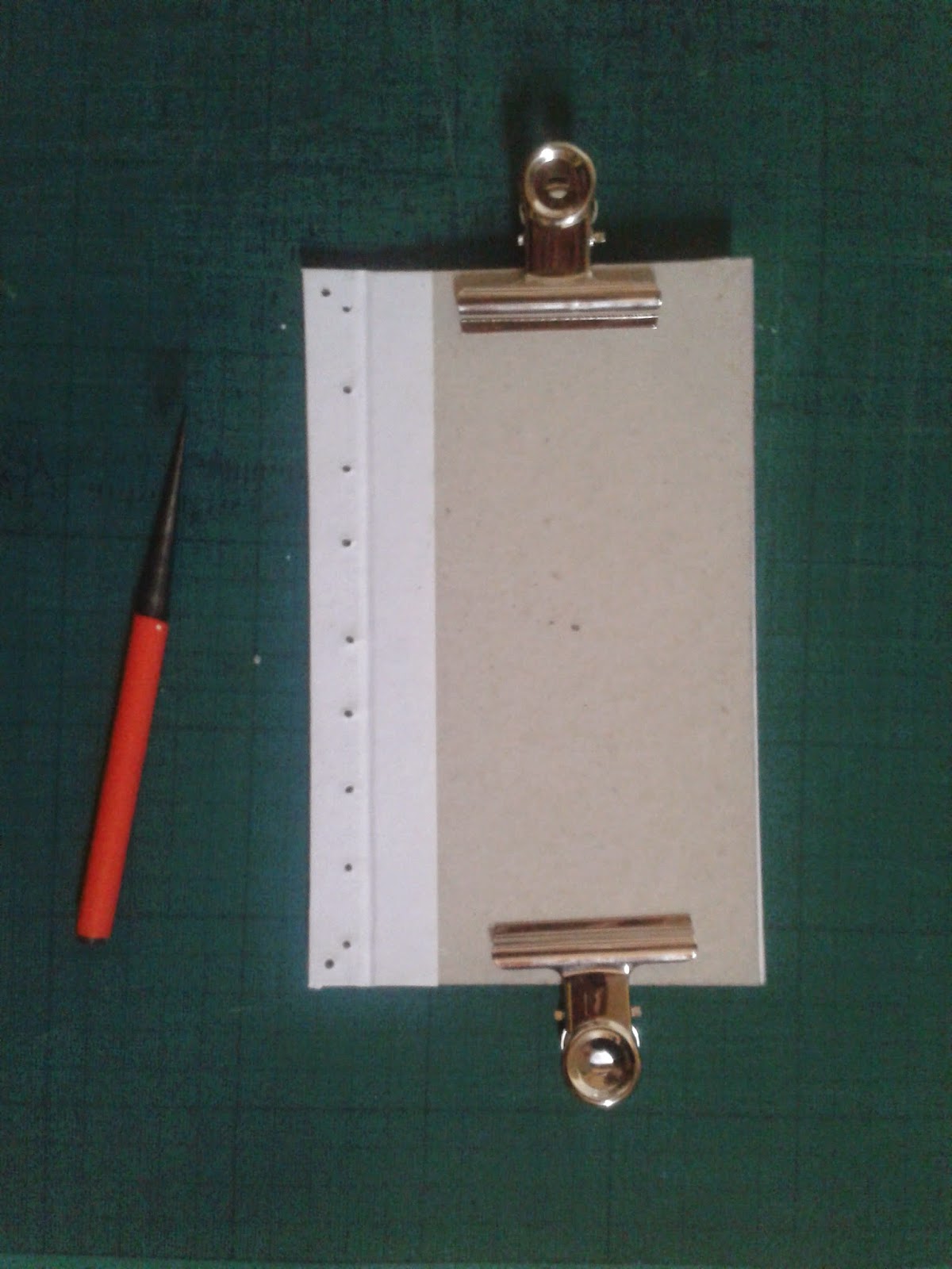
MOCK-UP BOOKLET
After completing the digital production of the booklet I decided to make a mock-up version before progressing with the physical production of the final outcome.
The process of creation was documented in a seperate blog post which can be found here - Post Link

PHYSICAL PRODUCTION PROCESS
Once I had completed a mock-up version of the booklet I felt confident to progress with the physical production of the final booklet. The pages were reviewed once again before being printed onto the outlined stock in the digital print room with James.
After printing the booklet onto A3 sheets I had to add the screen printed elements to the booklets pages before I could progress with the trimming or binding aspects of the process. The screen-printing had to be done straight after the digital printing process as the pages were untrimmed and flat, any height or folds created in latter stages could have seriously affected my ability to accuracy add screen printed elements to the outcome.
As the first screen printed element was the disappearing David Hudson printed in thermochromic ink I had to tape together two individual spreads due to the pagination of the booklet.


BINDING PROCESS
After all thermochromic aspects had been added I could progress with the binding process of the booklet. I felt confident when completing this as I had already experimented with the binding method and additional process when creating the mock-up version of the booklet.


As the booklet is utilising a Japanese book binding method pages were trimmed into individual leafs after being folded with the bone folder.

The cover was produced using the same technique applied when creating the mock-up booklet.


To puncture the binding holes into the cover stock I used an etching needle. Additionally, to ensure that all holes were the same diameter I added tape to the needle which served the function of allowing me to see when the holes were the same size.

Once all elements had holes punctured through them I progressed with the binding of the booklet. To do so I used the red, waxed hemp string previously purchased as part of the project.

Once the binding had been added the booklet its physical production was complete. I was really happy with the quality of the outcome as I feel the craft aspect of the booklet had been executed to a really high standard.

FINAL IMAGES
After completing the booklet I set up a D.I.Y photography studio at my house and took a series of final images of the outcome for presentation purposes.
A separate blog post documenting the final images can be found here - Post Link


PROBLEM
Upon reviewing the images I noticed a huge, soul crushing mistake that I somehow (no idea how) had managed to completely overlook during the various stages of the booklets production.
On the pages detailing the benefits or ORMUS the introductory paragraphs contents has somehow become severely jumbled, with parts of the text missing and words mixed up. I have no idea how this happened or how I managed to overlook it. However, as I had already spent hours binding and producing the booklet it was too late to rectify the mistake.
As a perfectionist this annoyed me more than anything as the outcome I was previously very proud of no longer met the standard of outcome desired. In future briefs I will ensure that I let other people help me check my outcomes for mistakes as I obviously managed to overlook this one.

No comments:
Post a Comment