
After creating my concept I started developing the various aspects of my project, I started this process by creating spider diagrams exploring the possible outcomes that I could produce as part of the brief.

What could be produced?
- Build guide
- Grow guide
- Business card
- Cook book
- Labels/tags
- Packaging (for info pack)
- Seeds
- Letter head
- Cook book.
I also created a diagram exploring possible aesthetic themes that the integrated graphics could follow.

Aesthetics;
- Vegetables
- Leaves
- Windows
- Dirt
- Mud
- Craft driven - hands on
Finally, after defining some of the project specifics I started by exploring each print outcome in more detail. When designing the outcomes I was careful to consider ways to reduce the amount of materials used to help the pack be more sustainable.


- The build and grow guides will be stitched into a z folding Constantina cover, this reduces material usage and allows the user to seamlessly flow from one book to the other.
- To hold the booklets together when not in use I will apply the use of some sting, this will be a common theme across the aspects of the outcome.

- I initially considered somehow utilising a plastic bottle to form the packaging as plastic bottles are used in the construction of the DIY Windowfarm. However, I decided against this ideas as getting the content inside the bottle would be almost impossible to do well.
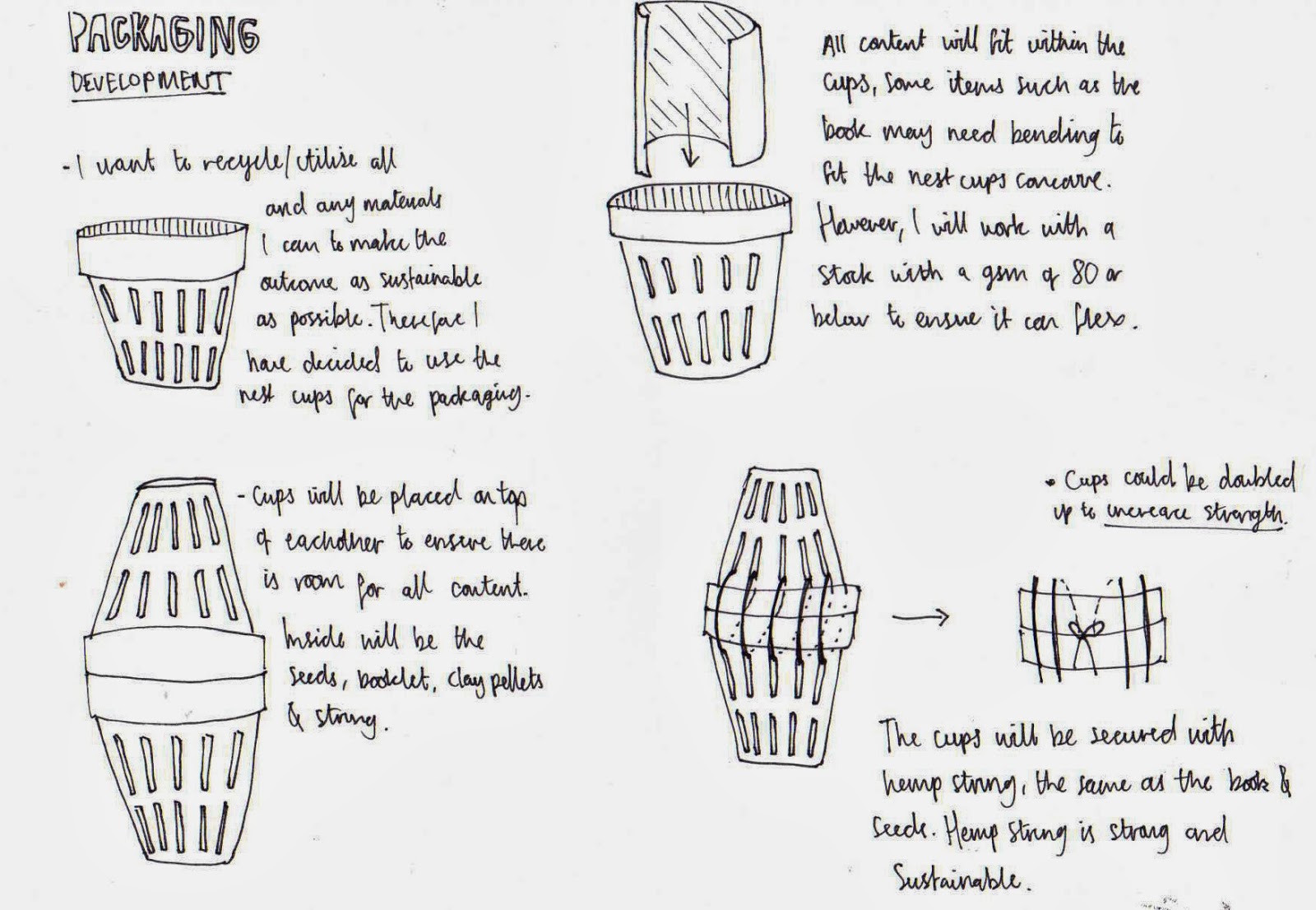
- Part of the DIY Windowfarm is the net-cups that hold the plants roots. The diameter of the mouth of the cups used is 3" with them being around 4" in height, therefore all of the contents form my outcome should snugly fit into two facing cups.

- I had material reduction in mind again when designing the seed packaging. Therefore, instead of creating individual packets for each seed type I planned to place them all into a singular pack formed from smaller individual packets.


- The small packets will be perforated to allow for east access of the seeds inside.
- The pack will also have a pocket for germinating tissues.


DESIGN DECISIONS
After defining the specifics of the concept and what will be produced I started making design decisions relating to the printed outcomes of the project.
- Typefaces
- Colour
- Stocks
TYPEFACES
When choosing the typefaces I gave thought to considerations such as;
- Legibility and readability (various sizes).
- Clear hierarchy (helps navigation).
- Aesthetic relevance.
I decided to choose one header font consistently across all aspects of the outcome to help form a strong, recognizable visual identity. The font will be applied to all printed outcomes, as well as the website and any proposed materials.
The header font needs to be attention grabbing and form a clear hierarchy with the other chosen typefaces. Therefore, I decided to look at bold sans-serif fonts such as 'Franklin Gothic Demi' and 'Langdon'.
The header font needs to be attention grabbing and form a clear hierarchy with the other chosen typefaces. Therefore, I decided to look at bold sans-serif fonts such as 'Franklin Gothic Demi' and 'Langdon'.

CHOSEN FONT
The clean, bold features of the heading font work well at grabbing viewer attention and asserting a clear typographical hierarchy. One aspect of the typeface that I want to develop is its clean aesthetic appearance, to represent the natural ethos of the company I want the font to look more rough and hand-rendered.

Next, I chose a font for the body copy aspects of the project.

CHOSEN FONT
For the chosen body copy font is legible at a small size die to its serifs and relatively tall x-height. Moreover, the contrasting features of the body font and header will help to form a clear typeface hierarchy that users can recognize and use to help navigation.

MIXING THE FONTS
To ensure that the fonts mixed well and created a clear hierarchy I experimented with creating a mock layout that allowed me to assess their compatibility as a font collection.

The choice of three fonts mix well and create a relatively strong typographic hierarchy that can be applied across all aspects of the outcome from the two booklets to the website.
One improvement that needs to be made relates to the choice of subheading font, I have chosen to utilise the same typeface for the body and subheading, using a larger point size to help users differentiate between the two. However, I believe that the subheading font needs to be more definable and attention grabbing as typography will be used to help guide the viewers eye around the page composition. To solve this problem, a bold version of the font will be applied instead, this will create a strong contrast to the small body-copy creating the visually engaging typographic hierarchy I desire.
COLOUR SCHEME
It is made clear in the concept that the project is based around promoting a sustainable, nutritious way for the audience to produce their own vegetables and fruit in a city environment. As the project is based heavily around nature and sustainability I have decided to utilise a colour scheme based on colours found in the natural environment, specifically the ones encountered when growing your own food.

It is made clear in the concept that the project is based around promoting a sustainable, nutritious way for the audience to produce their own vegetables and fruit in a city environment. As the project is based heavily around nature and sustainability I have decided to utilise a colour scheme based on colours found in the natural environment, specifically the ones encountered when growing your own food.
STOCKS
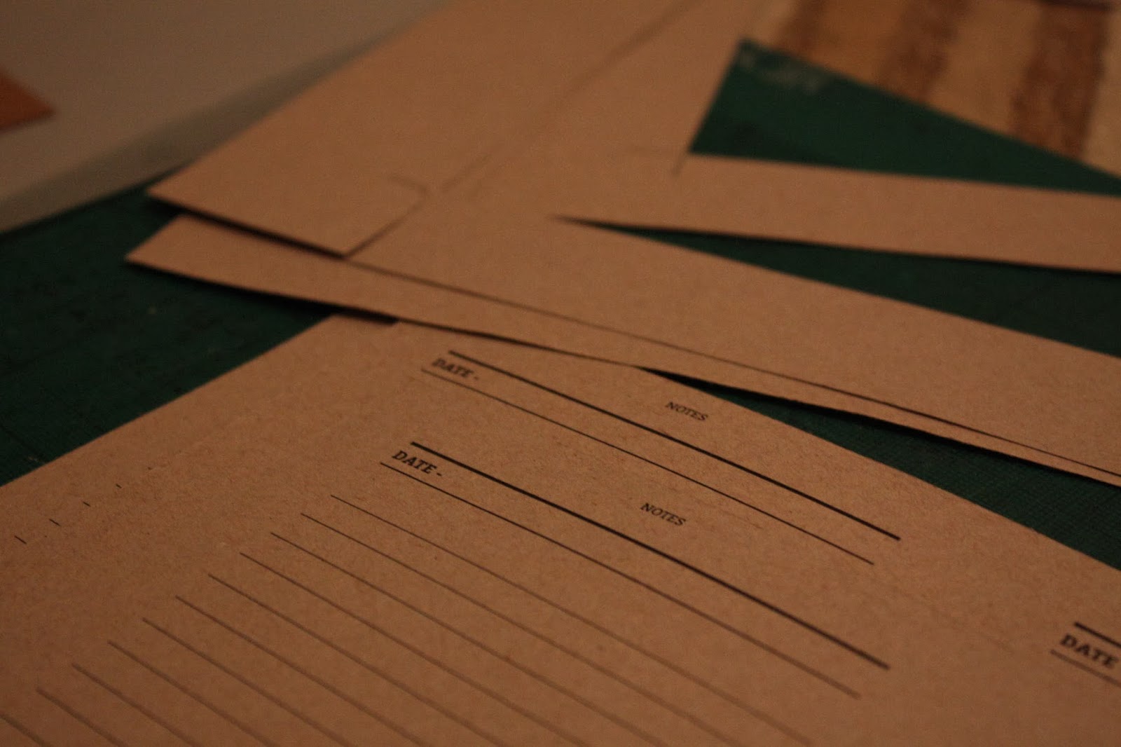
I wanted to utilise recycled stock to reflect the nature of the project and company ethos. Moreover, I also wanted to print onto a light brownish paper to reflect the natural aesthetic I am trying to create with the varying aesthetic features.
Both the cover and page stocks that were selected had a gsm of 80 or below to ensure that the booklets would be able to roll up and fit within the proposed packaging.
(add images)
CONTENT ORGANISATION
After finalising the projects design decisions I used my research to write the content for both the grow and build guide.


THUMBNAIL LAYOUTS
After writing the content for both booklets I started creating a range of layouts for the pages of the booklets. Creating established layouts enabled me to quickly digitally produce the booklets once all of the illustration had been created.


WEBSITE DEVELOPMENT
(scan in and add all development work)
PRODUCTION
After producing the layout variations and finalising all design decisions I was in a position where I could move the project along and start the initial production of all graphic elements. As the logo will be used consistently across both the print and web aspects of the project I decided to produce it first.LOGO
The first aspect of the project I wanted to create was the logo. The logo is an important part of every project as it is the visual element that the audience will interact with first. Therefore, not only does the logo need to be aesthetically engaging it also needs to hold relevance to the ethos of the company. Moreover, the logo is also applied across multiple platforms, and almost becomes the face of the company. Therefore, creating a successful logo is vital to the success of the project.
I started the design process by making a spider diagram exploring my initial ideas. Once I had a variety of different ideas I highlighted what I believed to be the strongest concepts.

From the highlighted words I started creating a range of hand-drawn logo variations.

After reviewing my variations I selected a design and started its development immediately. I used a stock image taken from the internet to create my initial sketches.


Cross-hatching was applied to create the etching style texture desired.

The illustration was scanned in and vectorised using the live trace tool. Variations were then created digitally exploring different typographic layouts.
Once I finalised a typographic layout I decided to add further relevance to the company by changing one of the 'O's's forms so that it looked like a window.

Finally, I wanted to make the clean aesthetic of the typeface look more hand-rendered so that it holds more relevance to the ethos of the company. Therefore, I printed the typography applying the mono-print process to create a textured outcome.


ILLUSTRATIONS
Hand drawn illustrations were created for various parts of the project such as for the booklet covers and for visually supporting content. The illustrations were created in a detailed etching style to create images that will capture the audiences attention and engage their creative side. Unfortunately, due to bad project management I did not have time to collect a range of primary images, therefore I had to utilise stock images taken from the internet as reference images.


My hand drawn illustrations are displayed below.


The hand-dawn elements were then placed into Illustrator and vectorised using the live trace tool.

MONOPRINTS
As outlined when I was defining my design decisions of the project I wanted the chosen fonts to look more hand rendered to reflect that natural, hands-on ethos of the project. To create the desired hand rendered look I decided to apply a mono-print to all the text displayed on the packaging and book covers. I chose to only hand render the display text as mono-printing each word was time-consuming, and working close to the deadline I unfortunately did not have the time to spare.

Repeats were made of any words I though could be illegible once developed in illustrator.


As outlined when I was defining my design decisions of the project I wanted the chosen fonts to look more hand rendered to reflect that natural, hands-on ethos of the project. To create the desired hand rendered look I decided to apply a mono-print to all the text displayed on the packaging and book covers. I chose to only hand render the display text as mono-printing each word was time-consuming, and working close to the deadline I unfortunately did not have the time to spare.
Repeats were made of any words I though could be illegible once developed in illustrator.
After scanning in the type I used the 'live trace setting in illustrator to create vectors of each work.
The type was then applied to various elements of the printed outcome.
DIGITAL PRODUCTION
Once I had finialised all of the digital design of the elements such as the tags and seed packets I started digitally producing the booklets. Producing the booklets was a relatively quick task as I had already created a set of layouts and written all of the content.
ILLUSTRATIONS (digital)
I started the digital production of the outcomes by creating all of the illustrations and tables that will be applied to each booklet. I went through the finalised content for each booklet and created illustrations for the most important aspects of the information.
After creating the illustrations I simply dropped the content and illustrations into the Indesign file to form the pages of the booklets.
- While pasting the type in I also simultaneously adjusted the line spacing to ensure there were no large gaps in between words that could affect legibility.
TRIMMING AND BINDING
All aspects of the outcome were digitally printed onto the
stock outlined in the development stages of the prject. Once all aspects had
been printed I started the hands-on production aspect of the project, starting
with the trimming and binding of the various elements of the project.
The photographs below document the production process and
display some of the technique I applied to ensure the successful creation of my
outcome.
I started the process by cutting the germination pouches out
of some kitchen roll. I ensured that their dimensions were at least 1mm less
than that of the seed packet to ensure
that the pouches fit snugly inside.
Next, using a metal ruler and scalpel I cut out the pages of
the note book.
Then, I used a bone folder to fold the pages of the
notebook, using a bone folder ensures that the creases were clan and crisp.
Using the ruler and scalpel I trimmed the page edges so that
they were all flush.
Next, I clipped the notebook cover and pages together using
a bull dog clip and pierced binding holes through the whole booklet.
Finally, I measured the distance between the two holes to
help me work out the amount of string needed for binding. Then using them
hemp-string supplied with the pack I bound the pages of the booklet together.
Next, I produced the tags that will label each element of
the pack. After cutting out the tags I applied glue so they could be backed
with a second stock to make them thicker. As the tags were only printed on an
80gsm stock they needed their thickness increasing to stop the stock from
curling.
After the gluing was complete I placed the tags in a DIY
press made from a book and bottle of Jack Daniels. The aim of the press was to prevent the tags
from warping while the glue dried.
Next, I prepared the seed tubes. The tubes were cut from the
stock using a scalpel and ruler and assembled with the application of glue.
Seed selection.
Then, seeds were added to each tube with the tube being
glued shut once all seeds were inside.
To allow the user to access the seeds I used my perforation
tool, specially purchased for this project, to perforate the tops of each
packet. The perforation will allow users to easily open the tubes and access
the seeds inside.
String was added to the packaging to act as a binding method.
By this point the tags had finished drying in the press, and
so were ready for the application of the hole-punch.
Once the tags had been hole-punched they were ready to be
applied to the various elements of the information pack.
Next, I repeated the process of trimming and binding the
pages using a scalpel, ruler, etching needle and string.
To ensure that the holes were punched in the same place on
each booklet I made a small jig. The jig was clipped to the booklets pages
using the bulldog clip to indicate the positioning of the binding holes.
Then starting with the grow guide were attached to the ‘Z’
folding Constantia folding cover.
Before binding the build guide into the cover I first had to
prepare the cutting templates. Using a bulldog clip I attached the templates to
the booklet pages while using the etching needle to pierce the binding holes.
To ensure that the templates can be removed and applied to
the various elements of the Windowfarm I perforated the centre fold, this will
allow users to easily remove the temples without tearing the paper.
Finally, I repeated the process of binding the booklet into the
z-folding cover to complete the production process.
PROBLEM!
After I finished physically producing the various elements
of the project I tried placing them into the net-cup packaging. Unfortunately,
due to the combined mass of all the various elements not all items would fit
inside of the cup. The problem could not have been foreseen as when I measured
the dimensions of the booklets against that of the net-cups it was apparent
that everything would fit inside.
To overcome the problem I had to quickly produce some packaging from some reused cardboard that was lying around in my room. The re-use of material ensured that the packaging was sustainable, a key principle of the Window farms ethos.
No comments:
Post a Comment