
- The connected 'A' and 'S' could represent the connection shared between an astronaut and the space shuttle during a space walk.
- The logo was scrapped in 1992 after its association with the challenger shuttle disaster in 1986.
- Letters are similar to the piping used when astronauts go on a space walk.
- The letter 'A's' reflect the trajectory of a rocket going to space and back.

- The colour red was chosen for a variation of the logo due to its associations with danger, being an astronaut is a very dangerous job so it represents this factor well. However, colour psychology tells us that red is also associated with courage, strength and excitement which are also terms associated with the occupation.
After the class discussion about the 'Nasa' logos each member of the group had five minutes to present their logos, covering points such as;
- Why certain colour schemes have been used?
- Why dose the logo take that form?
- Who is the target audience?
- How does the logo cater to that audience?
While the presentations were taking place we made notes on any logo aspects that were effective, or on techniques we had little knowledge about. Below are the notes I took while the presentations were taking place;
- Certain colours such as yellow and red are used to evoke hunger, this is evident when we look at the logos used by fast food companies.
- Many effective logos gave meaning to the company name, two good examples of this was found within the 'Bearhanded' logo that I presented and the 'Lack' logo Laura displayed to the group.


- Subtle images created with type are aesthetically engaging.
- Simple logos are instantly recognizable.
- Colour can drastically effect the logos communication
- Effective logos adapt simple semiotics to creatively communicate the company ethos, an example of a logo that achieved this was presented by Bobby.

After finishing our discussions we discussed the importance of having a concept when designing a logo.
A logo without a concept is just a piece of eye-candy.
Without a concept logos are meaningless, and therefore are much easier for the viewer to forget. As designers we must create appropriate concepts to give outcomes meaning, we then must use type and image to creatively communicate the concept in a simple, quick to understand way. - Easier said than done.
To help us further understand the importance of having a concept we were asked to look at some existing concepts in more detail;
CONCEPT
DUVAL - Logo and label design for due and wood protectors' tins of TM Duval.

- The icon created for the logo is simply designed making it very eye catching. Moreover, it also reflects the nature of how the product is applied, by hand and with a brush.
- The type used is minimal giving it a very modern, classy feel, this communicates to me that the product is slightly up market from the more commercially available wood protectors.
- The composition of the logo is very effective as the icon and 'V' have visually similar properties and have been placed parallel to each other, this causes the eye to lead down from the icon to the type.
- Finally, a range of colours have been selected, but are only applied to the end of the brush icon, this enables the logo to be re-used effectively across a range of products.


Task
At the end of the session we were given a small task to complete;
Find out about one (or more) logo that you find really interesting and dissect it.
'Artfarm' Logo

When looking at the 'Artfarm' logo the viewers eyes are instantly drawn to the effective illustration that cleverly creates an image of a 'pencil fence'. The icon visually communicates the name of the company and acts as a way of grabbing viewer attention. Moreover, the the icon is also supported by a clean, legible typeface that gives the composition a dynamic feel. On a whole, the logo is visually engaging and suits the creative audience that would come into contact with it.

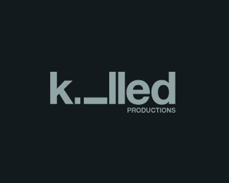
Firstly, when looking at the logo the viewers eyes are attracted to the negative space created by the horizontal 'i', this ambiguity has been purposely put there by the designer as a visual representative of the word 'killed'. Furthermore, the 'i' symbolizes something that has been killed, assuming a lying down position similar to a deceased person, this inventive use of type not only makes the logo interesting but also memorable.
Finally, this logo created for 'Half Badger Records' is effective due to the humorous side of the company name and illustration. Taking a dominant position in the composition, the audiences focus is directed towards the illustration, which, due to its content captures viewer attention with its unusual form. Moreover, the image is supported by a simple sans-serif typeface that retains its legibility and takes no focus away from the illustration. Finally, the colour scheme utilizes three different tones of green, this completes the look of the logo and makes the image more engaging for the audience.
No comments:
Post a Comment