Next, we reviewed the six print related categories covered in last weeks session, writing down our view of each categories definition. Moreover, we also included some examples of techniques or items that fall within each classification.
Below is an image of the group list.
Next, we reviewed the list as a class, discussing in more detail the specifics of each category;
CLASS LIST
- FORMAT - Scale + Size + working with that.
- COLOUR - Colour modes, Hues, Function etc. Effects the process and production.
- PRODUCTION - The actual making of it.
- PROCESS - The method used.
- FINISHING - Production + Process.
- STOCK - Materials used - Substrates for printing/considerations for example; Cost.
All of the above processes are interlinked, when successfully designing for print all categories MUST BE CONSIDERED.
Finally, the exercise enabled us to re-discuss each topic in a group which helped to create an informed understanding of the print categories and how they relate to each other. Furthermore, the group discussions held while creating the list helped clear up any confusion about the classification of each category.
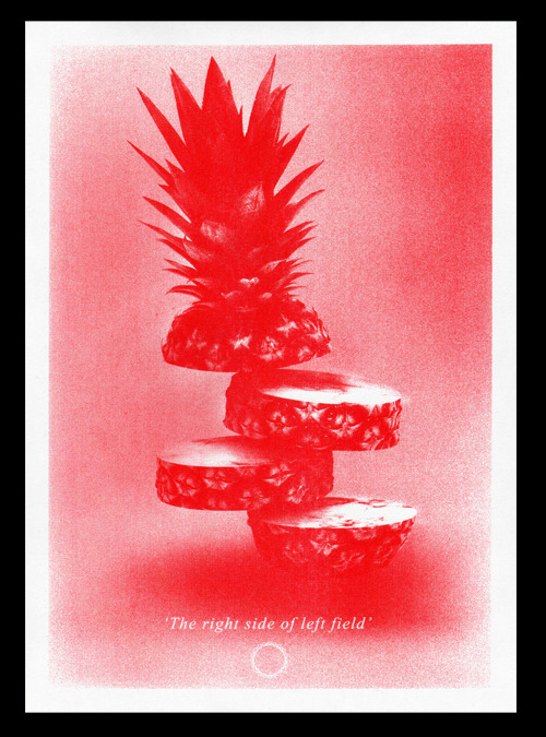
After a short break we started the second half of the session. In last weeks lesson we were asked to bring in 5 examples of print, this could be anything that had undergone part of the print process.
Next, each group was asked to arrange the examples into groups reflecting the print process categories, starting with 'Format' we arranged our examples into small piles.
Format.
 |
Colour groupings.
|
Process
While arranging the examples into groups various discussions arose regarding topics such as;
- If an example fit that group.
- Cost of printing
- How different techniques are used.
Finally, we reviewed the exercise and identified print related things that we want to know more about.
- Research into the finishing technique spot varnishing.
- Review how this techniques is done.
- Research into how tissue paper is printed on.
RESEARCH
SPOT VARNISHING & HOW ITS DONE.
Spot Varnish.
I started by finding out what a spot varnish is;
Varnish is basically clear ink and can be gloss, satin or matte. A flood varnish covers the entire printed page for protection or sheen. A spot varnish allows you to highlight specific areas of a printed piece and adds shine and depth to specific elements on the page such as a logo or image. Varnishes are also applied on-press, but they are heavier-bodied and can be applied (like inks) to only certain areas (spot varnish). A plate must be created to apply a spot varnish, so artwork is necessary. Information link

Next, I found out how the technique is applied;
As mentioned above the varnish itself shares similar properties as an ink; 'Varnish is basically clear ink'. Therefore, the technique can be applied using traditional printing techniques such as a silk-screen print, where the varnish is pushed through a screen directly onto the stock. Moreover, while collecting my research I also came across examples of spot varnishes being applied digitally using a printer, this helps with commercial projects that require a large quantity of units producing.
The video below shows a spot varnish to a large limited addition artist print, the printers use a commercial screen-printing machine to apply the varnish to the piece.
PRO'S
CON'S
- Added cost to the print job.
- If printed over a crease in a document it will crack in the same way ink does.
- Application of the technique adds time to print job.
PRINT TECHNICAL TERMS
Below are a list of useful print technical terms I was unfamiliar with, I have highlighted specific information that is relevant to the print production brief;
Papermade from pulp containing little or no acid so it resists deterioration from age. Also called alkaline paper, archival paper, neutral pH paper, permanent paper and thesis paper.
An acid-proof protective coating applied to metal plates prior to etching.
An offset printing plate having a treated surface in order to reduce wear for extended use.
Fine powder lightly sprayed over the printed surface of coated paper as sheets leave a press. Also called dust, offset powder, powder and spray powder.
Coating in a water base and applied like ink by a printing press to protect and enhance the printing underneath.
(1) To print on the second side of a sheet already printed on one side. (2) To adjust an image on one side of a sheet so that it aligns back-to-back with an image on the other side.
Usually a department within a printing company responsible for collating, folding and trimming various printing projects.
Rubber-coated pad, mounted on a cylinder of an offset press, that receives the inked image from the plate and transfers it to the surface to be printed.
A page number not printed on the page. (In the book arena, a blank page traditionally does not print a page number.)
Image debossed, embossed or stamped, but not printed with ink or foil.
Sticking together of printed sheets causing damage when the surfaces are separated.
Prepress photographic proof made from stripped negatives where all colors show as blue images on white paper. Because 'blueline' is a generic term for proofs made from a variety of materials having identical purposes and similar appearances, it may also be called a blackprint, blue, blueprint, brownline, brownprint, diazo, dyeline, ozalid, position proof, silverprint, Dylux and VanDyke.
Category of paper commonly used for writing, printing and photocopying. Also called business paper, communication paper, correspondence paper and writing paper.
Folded signatures gathered, sewn and trimmed, but not yet covered.
A photographic print created on bromide paper.
The effect produced by dusting wet ink after printing and using a metallic powder.
To bind by forcing glue into notches along the spines of gathered signatures before affixing a paper cover. Also called burst bind, notch bind and slotted bind.
Register where ink colors meet precisely without overlapping or allowing space between, as compared to lap register. Also called butt fit and kiss register.
Below are a list of useful print technical terms I was unfamiliar with, I have highlighted specific information that is relevant to the print production brief;
- Acid-free Paper
- Acid Resist
- Anodized Plate
- Anti-offset Powder
- Aqueous Coating
- Back Up
- Bindery
- Blanket
- Blind Folio
- Blind Image
- Blocking
- Blueline
- Bond paper
- Book Block
- Bromide
- Bronzing
- Burst Perfect Bind
- Butt Register
- Carbonless Paper
- Case
- Case Bind
- Cast-coated Paper
- Chain Dot
- Chalking
- Choke
- Chrome
- Collate
- Collating Marks
- Color Cast
- Color Control Bar
- Color Gamut
- Color Sequence
- Color Shift
- Complementary Flat(s)
- Composite Art
- Composite Film
- Composite Proof
- Condition
- Contact Platemaker
- Continuous-tone Copy
- Coverage
- Crash
- Creep
- Cure
- Cutting Die
- Deckle Edge
- Densitometer
- Density
- Density Range
- Digital Dot
- Dot Gain
- Dot Size
- Double Black Duotone
- Double Bump
- Double Dot Halftone
- Drill
- Dry Back
- Dry Offset
- Dry Trap
- Duotone
- Duplex Paper
- Duplicator
- Emulsion
- Emulsion Down/Emulsion Up
- End Sheet
- EP
- Equivalent Paper
- Face
- Felt Finish
- Felt Side
- Fifth Color
- Film Laminate
- Flat Color
- Flat Size
- Flood
- Flush Cover
- Foil Emboss
- Foil Stamp
- Foldout
- Folio (page number)
- Form Roller(s)
- French Fold
- Full-range Halftone
- Gang
- Ghost Halftone
- Ghosting
- Gilding
- Gloss Ink
- Grammage
- Gravure
- Gray Scale
- GSM
- Half-scale Black
- Halo Effect
- Hard Dots
- Heat-set Web
- Hickey
- High-fidelity Color
- High-key Photo
- Highlights
- Hot Spot
- Imposition
- Impression
- Impression Cylinder
- Imprint
- Ink Balance
- Ink Holdout
- Inserts
- Intaglio Printing
- Key
- Keylines
- Key Negative or Plate
- Kiss Impression
- Laid Finish
- Laminate
- Laser-imprintable Ink
- Linen Finish
- Lithography
- Looseleaf
- Loose Proof
- Machine Glazed (MG)
- Manuscript (MS)
- Mechanical Bind
- Mechanical Separation
- Mechanical Tint
- Midtones
- Misting
- Moire
- Mottle
- Mull
- Nested
- Nipping
- Nonheatset Web
- Nonimpact Printing
- Offset Printing
- Outline Halftone
- Overlay
- Overlay Proof
- Overprint
- Over Run
- Pagination
- Painted Sheet
- Panel
- PE
- Perf Marks
- Perforating
- Pinholing
- PMS
- PMT
- Post Bind
- Quarto
- Rainbow Fountain
- Relief Printing
- Repeatability
- Reverse
- Ruleup
- Satin Finish
- Screen Ruling
- Separations
- Serigraphic Printing
- Soft Dots
- Soy-based Inks
- Spectrophotometer
- String Score
- Stumping (Blocking)
- Substrate
- Target Ink Densities
- Thermography
- Tip In
- Tone Compression
- Total Area Coverage
- Touch Plate
- Trap
- Undercolor Addition
- Undercolor Removal
- Unsharp Masking
- Up
- Vellum Finish
- Vignette
- Vignette Halftone
- VOC
- Wash Up
- Web Break
- Web Gain
- Web Press
- Wet Trap
PRINTING ON TISSUE PAPER
Finally, I researched into printing on tissue paper after being inspired by the tissue paper money that I brought to the session as a print example. I was intrigued by the print as the ink had not bled through to the other side of the tissue paper, which would usually happen using most print techniques. Moreover, I think that the technique holds value as printed tissues could be used within restaurant branding.
After browsing the internet I found numerous sites outlining how the technique can be quite easily done at home, non-commercially. The trick is to use a laser printer to prevent the inks from running through the tissue, which should be tautly taped to a piece of paper.


Both black and white and full colour images can be produced using the technique.
TASK
At the end of the session we were given a short task to complete for next lesson. The task asked us to collect five examples of logos and/or branding work and note down why we find the logo appealing.
Below are my examples;
- The creative illustration caught my eye, cleverly communicates company name through imagery.
- The clean sans-serif font is easily legible.
- Colours are calming.
- The composition is well balanced.
- Logo created for a womans clothing company, this is reflected with the script typeface selected.
- Elegant, engaging typography used to grab viewers attention.
- Creative use of the joining 'I' & 'S' gives the logo a nice flow, this is further highlighted by the arrow that flows through the type.
- The logo has a classy look which appeals to the target audience.
- Logo cleverly adapts the vertex of the W to create the top of a water droplet, the symbol is simply finished with two subtle strokes.
- The logo is engaging due to the creative illustration.
- The logo has a clean corporate feel insinuated by the formal colour choice and serif typeface.
- This logo is effective due to its clever adaptation of the typography, the letters have been altered to form an image of a bison.
- I think this is an interesting logo as the companies name would still be communicated from a distance, despite if the type is legible or not.
- My final logo has been designed for 'Habitat' and environmentally friendly skateboard company.
- The color green reflects the companies ideologies due to its association with nature and sustainability.
- The logo also contrasts the green feel of the logo with the black type, which reminds me of an urban landscape, this holds relevance to the environment in which the sport takes place.
- Simple vectors used to symbolize trees/nature.


