Upon recieving the brief we were given a randomly selected animal, mine was the cheetah. I will now collect a body of research into the animal, this will then help me define the purpose, tone of voice and audience.
Using the body of research I collected I started generating ideas about the content of the article. I used the information gathered from books and websites to help me think what the content of the article could be.
IDEAS GENERATION
After reviewing my 'ideas generation' sheet I had two main points that I could focus the article on.
IDEA REFINEMENT
To progress with the brief I first needed to select an idea to focus on. When researching into cheetahs I found quite a few articles about the animals speed and agility. However, a lot of these articles just use regurgitated information and inform people what they already know. Cheetahs can run fast. Additionally, while collecting my research I also found out that cheetahs are in big trouble. They are an endangered species with dwindling numbers in the wild, they have only a small amount of territory left but are still hunted and captured by humans.
Audience
The target audience will be people who care about animals, the environment and who are interested in the current status of the cheetah species .
Tone of Voice
The article will have a formal tone of voice, which will be supported by a tidy design. The layout will position the text so that the readers eye flows across the article and images effortlessly.
Purpose
The purpose of the article is to inform and educate the audience about the illegal pet cheetah trade and how this affects the dwindling numbers of wild cheetahs. In my research I found disturbing facts such as there are less that 15,000 cheetahs left in the wild. Moreover, I also found countless reports about the illegals smuggling of wild cheetah cubs. The article will include facts and figures regarding the trade of cheetahs, as well as inform the audience of the conservation effort.
Content
I will base my article on the illegal cheetah trade and how this affects the spices struggle for survival.
- Cheetah information.
- Information on dwindling numbers
- Problems and Threats.
- Cheetahs as pets.
- The Black Market.
- Who is responsible?
- What can be done to help?
Tone of Voice
The tone of voice will be formal, similar to the journalistic writing found in National Geographic articles.
ARTICLE
In the brief it states that the magazine layout must be supported by a 500 word article on my animal. As I am creating a formal, informative magazine spread on the illegal trade of wild cheetahs as pets achieving the correct tone of voice is important. The article will be written in a journalistic style, and focus on the number of cheetahs in the wild and how the trade affects this.
I based the articles structure loosely around this plan. The main point I wanted the article to communicate is how the trade is wrong, and the serious repercussions it will have if it continues.
Final word count - 860
IMAGES
Moreover, after writing the article I chose a range of images from my research that will be used along side the text. I chose images that were shocking and captured the nature of the article, as this will aid the communication of the articles message. Moreover, it will also help evoke an emotional response from the audience as they will be able to see what the awful content of the article is talking about.


I like these images as they are relevant to the articles content and work as a set.

DESIGN SHEETS
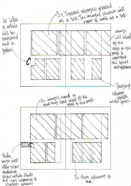
After defining the context of the magazine I created thumbnails of possible compositions the article could take. When creating designs I wanted to experiment with how the readers eye could be guided across the spread using the elements of the article. Moreover, I also aimed to achieve a balance between type and image, so I also experimented with symmetry and negative space in some design variations.
REFINED DESIGNS
After reviewing my initial thumbnails I selected two possible layouts that the article could use. Working from my thumbnail designs I created an enlarged version, this enabled me to see the pitfalls of the design and make changes. When designing the layouts I had to think about where I wanted to direct the viewers attention. Offsetting the title means that it hangs past the other aligned elements of the article, catching the viewers attention and directing their focus to the start of the article.
Finally, I selected one layout from my refined designs to use as the layout for my cheetah article.
I chose this design as your eye flows nicely across the page from the title to the end of the article, and then across the three images. The text has been placed above the images as I want the audience to first read the article and then see the supporting images. The article needs to be read first as it communicates the message of the spread. I will use the three images of the cheetah cub that was found in Saudi Arabia as they work as a set. Moreover, their shocking nature supports the content of the article. The flow of the page is supported with the horizontal lines which guide the eye around the spread.
The article will rely on a balance between type and image to communicate its message and get the desired reaction from the audience. To achieve a balanced page I want the height of the columns and images to be similar. Additionally, I have left negative space on the composition so the spread doesn't seem too busy.
COLOUR
As mentioned when defining the concept of my article I want the design to be formal, so the viewers focus is on the information presented in the article and the images. Therefore I will simply use a white background, all text will be black and the pictures will be full colour.
TYPEFACE
DIGITAL PRODUCTION
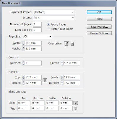
Below is the digital production process of my double page spread. I didn't use a bleed as the design wont be trimmed down after printing but presented on an A3 sheet as stated in the brief. Therefore, the document was created at A5 size so the double page spread will be A4, and fit nicely on an A3 sheet.
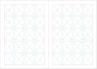
I used a 4x5 grid on each page to help me organise the elements of my layout.
Using my final design I created the layout accurately using the grid to help me accurately place and size the elements of my design. However, the design was changed slightly, on the second page of the spread the column width changed so that the text and pictures aligned along a gutter, this made the column double width.
This worked out for the better as the text took up more room than I had first anticipated.
To help guide the audiences eye to the next page where the article continued I added a small triangle symbol, I placed it next to the last word on the first page to tell the viewer to continue reading on the next page.
I then added the images and title.
Unfortunately the images I have used are really bad quality so look pixelated. I need to try and find some higher quality images that are relevant to the content of the article.
REFINEMENT
After reviewing my spread there were a few things that I noticed and wanted to change to make the spread look more professional.
Next, I updated the images to ones that were higher quality and not pixelated. Although the images don't work as well because they are not all taken by the same photographer, they are higher quality so will make the spread look more professionally finished.
Finally, I adjusted the line length so they fit the elements of the design.
FINAL
DESIGN BOARDS
Finally, it is mentioned in the brief that our projects progression should be presented on design boards when submitting. Therefore, I prepared some design boards to support my project, these will be submitted with the final print of my spread.
(add design boards)
EVALUATION
Firstly, upon receiving the brief we
were each given a randomly selected animal, this would define the focus of our
article. However, the content would still be defined by us after collecting a
body of research into the animal. Animals were selected for each person from
the randomizer, when my name was called out the cheetah selected and so became
my point of focus. I was happy with this selection as cheetahs are fascinating
animals.
I collected the majority of my research from
secondary sources such as the National Geographic website and wildlife books
from the library. The National Geographic website they have various information
heavy articles on the cheetah which I found really helpful when gathering basic
information on the cat. Additionally, after looking through their archives I
discovered a really thought provoking article which would come to influence the
content of my article. The story titled ‘Cheetahs on the Edge’ talked about the
struggle for survival that the species is facing and touched upon the modern trades
that are affecting the cheetah population, one of these was the illegal cheetah
pet trade in gulf states such as Saudi Arabia. I found this section of the
article really engaging as I was previously unaware of this trade and its
effects. Therefore, I started focusing my research on this trade.
Once the article was finished I started
designing thumbnail variations of possible layouts the article could use. When designing
these I was thinking about considerations such as how I wanted the readers’ eye
to flow round the page, and how I could guide it using the elements of the
article. In my research I initially looked at creating a generic wildlife
spread, similar to the ones found in National Geographic. These designs have a
large background image relevant to the articles content; the elements of the
design are then placed in the negative space left by the image. This is an effective
way of displaying high quality imagery of the animal. However, the brief states
that we have to use three images or more, and placing images on top of a larger
background image can make the composition look too busy. Therefore, I focused
on designing a formal spread that delivered the information in a
straightforward fashion.
After refining and selecting a layout the
design was digitally produced using InDesign. Unfortunately, due to a lack of
access to zoos and animal parks I could not collect any primary images of my animal.
So had to rely on images found on the internet. This proved to be a problem as
most of the images that were directly relevant to the article were really low
in quality and highly pixelated. The initial images I chose worked really well
as a set and showed a young cheetah cub that had been found starving, wandering
the streets. Despite their direct relevance I could not use the images as their
resolution was terrible. I wasted a lot of time trawling through the internet looking
for relevant, quality images.
After reviewing the magazine spread I made
some small design changes. The first was a change of typeface. I had chosen to
use Arial, a really formal quite boring font, when looking at the spread it didn’t
have any impact. Therefore, I chose to change it for a bold display font called
‘Bebas’ which was more engaging for the viewer. Other small changes were also
made to the design to improve its overall aesthetic quality.
Finally, the design was created for a
demographic of young adult readers who already have an interest in nature,
wildlife and world problems. The target audience defined the tone of voice in
which the article took, as to engage these readers it had to be formal and have
a journalistic nature. I think that the article achieves this by presenting
facts and figures alongside the shocking nature of the story. Moreover, the
formal nature of the article is reflected in the design of the spread. There is
a basic colour scheme used so that no focus is taken away from the articles
content or imagery. Moreover, design decisions were made to help guide the
audiences’ eye around the article so that the article is read first which is
the supported by the three images. Finally, I think that the article is effective
in how it communicates its message and suited for its target audience.


No comments:
Post a Comment