
1. Anatomy of Type
Firstly, graphic designers work with typefaces, fonts and typography on a daily basis. For a professional designer it is essential to know the rules and terminology associated with type.
Moreover, it is essential to know the basic terminology associated with typography.
Moreover, it is essential to know the basic terminology associated with typography.
Typeface – A collection of letters, numbers, symbols, punctuation etc. Which have the same design.

Font – The physical means used to create the font, be it computer code, letter press etc.
Font types
Roman – serif fonts
Gothic – Sans serif fonts
Script – hand rendered looking fonts
Block – Display/header fonts.
Typeface anatomy


Character
A character is any individual letter, numeral or punctuation. Letters can be uppercase or lowercase, uppercase characters are capital letters.
Ascender
A lowercase stroke that ascends to the x - height, can be seen on the lowercase 'h'.
Bar
A bar is the horizontal stroke that can be found on letters, an example can be seen on an uppercase 'A' or 'H'
Baseline
The baseline is the line that the line that the body of the characters sit on. I have left the underline option on to show the baseline.
Bowl
The curved stroke which surrounds a counter.
Bracket
The bracket is the curved line that joins a serif to the letter.
Counter
A counter is the negative space left by the inside of a letter. A good example of a counter can be seen within the body of the letter 'O'
Descender
A descender is the stroke from a lowercase character that extends below the baseline.
Sans - serif
Sans - Serif is french for 'without serif' meaning that characters that are 'sans - serif' have no serifs, an example of a sans - serif font is 'Helvetica'
Serif
Opposing 'Sans - Serif', serif fonts have tapered ends as seen within the 'Times New Roman' typeface. It originates from when letters were carved into stone, as the stonemason would have capped the letters when carving.
Shoulder
The curved stroke coming from a stem.
Stem
The vertical or diagonal line of a character.
X - height
The x - height is the line on which the tops of the lowercase letters finish.
2. Typeface Hierarchy
Moreover, any graphic designer that works on an outcome that needs to use one or more fonts will also need to know how to mix fonts correctly. Using typeface hierarchy ensures that the audience read the article in the correct order, starting with the heading.
When producing outcomes that use more than one font a clear typeface hierarchy must be used, even if the fonts are from the same typeface. Information used to form the content of an outcome will be placed into blocks of information, the blocks will be ordered according to their importance.
The hierarchy of a font can be affected by its size and weight, a heading will usually be large and bold so it is easy to differentiate it from the rest of the text.
For example, the title of an article will need to grab the audiences attention immediately. Therefore will be placed at the top of the page, in a large legible font.

3. Legibility and Readability
Firstly, legibility and readability are based on the relationship and space between letters.
Legibility – The degree to which glyphs in text are understandable and recognisable based on appearance.
Readability – The ease in which text can be read and understood. It is influenced by line length, primary and secondary leading, justification, type scale, kerning, trading point size etc.
One way we are able to define letters is by looking at the counter, which is the negative space left by the letterform whether fully closed or semi open. Moreover, negative space can also define a letterform or shape. An example of this can be seen in the 'FedEx' logo where the 'E' and 'X' create an arrow with the negative space.

Designers must lean how legibility and readability can be avoided, so that steps can be taken in the design process to ensure that the text is always readable.
Elements that affect Legibility and Readability.
Leading - the space between characters.
Tracking - is increasing the leading, by tracking the spaces inbetween the characters can become too large making it hard to read the text/word.
Kerning - is condensing/reducing the leading, if this is reduced letters become illegible.
There are three design features that make a typeface legible:
1. Large X-Height:
A large x-height increases the negative space within each letter. This makes it’s shape much more discernable.
2. Large Counters:
The negative space within a letter is called a counter. When a typeface has large counters, it is easier to distinguish the shape of each individual letter.
3. Simple Letterforms:
The simpler a letterform, the more legible it is. Sans serif types are generally more legible than their serif counterparts because they do not have any serifs interfering with the shapes of the letters. However, this does not mean that sans serifs are necessarily easier to READ in text. Actually, serif types are generally considered MORE readable. The exception to this rule is on-screen. Because of on-screen distortion, sans serif is the best choice for readability.
Legibility – The degree to which glyphs in text are understandable and recognisable based on appearance.
Readability – The ease in which text can be read and understood. It is influenced by line length, primary and secondary leading, justification, type scale, kerning, trading point size etc.
A large x-height increases the negative space within each letter. This makes it’s shape much more discernable.
The negative space within a letter is called a counter. When a typeface has large counters, it is easier to distinguish the shape of each individual letter.
The simpler a letterform, the more legible it is. Sans serif types are generally more legible than their serif counterparts because they do not have any serifs interfering with the shapes of the letters. However, this does not mean that sans serifs are necessarily easier to READ in text. Actually, serif types are generally considered MORE readable. The exception to this rule is on-screen. Because of on-screen distortion, sans serif is the best choice for readability.
4. Basic colour theory
Firstly, any designer working with one or more colours needs to understand basic colour terminology, as how we perceive colours can be affected by the way we use them.
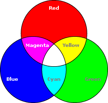
The three primary colours found on Itten's colour wheel are blue red and yellow, they can not be created by mixing any other colours.
The three primary colours found on Itten's colour wheel are blue red and yellow, they can not be created by mixing any other colours.
Moreover, secondary colours are created when two primary colours are mixed. The secondary colours are Green, Orange and Magenta.
Tertiary colours are a combination of secondary and primary colours.

5. RGB - CYMK
Another thing that is essential for designers to know is the difference between the colour modes RGB and CYMK. Not knowing the difference between these could seriously affect the quality of the outcome.
RGB Colour Mode
RBG stands for Red, Green & Blue which are the three colours used to create the colours we see when looking at screen-based media such as televisions and laptop screens. The RGB colour mode is also additive, which means the colour value increases as more colours are mixed.
When creating work for scree-based media the RGB colour mode must always be selected in whatever program you are using. Failing to use the colour mode will result in an inaccurate portrayal of colour and brightness.

CYMK Colour Mode
CYMK stands for Cyan, Yellow, Magenta & Key which are the colours of the inks used in modern commercial printing methods such as offset lithography. These colours form the CYMK colour mode which is used when creating a printed outcome. CYMK is a subtractive colour mode, as when you mix the inks colour value is lost.
It is important for a designer to know the difference between the colour modes as if a printed outcome was created in RGB the colours would be different to the ones shown on screen.

6. Itten's Seven Colour Contrasts
Any designer working with colour needs to learn Itten's seven colour contrasts, knowing about them is key to achieving successful balanced colour. Due to how our eyes perceive colour they can be tricked into thinking that the colour value is different than it is.
Itten's Seven Contrasts
- Contrast of tone - Formed by the juxtaposition of light and dark values. This could be monochromatic (single colour). If you remove the chromatic value the tonal value can be defined more easily.
- Contrast of hue - Formed by the juxtaposing of different hues. The greater the distance between hues on a colour wheel, the greater the contrast. Therefore, complimentary colours have the greatest contrast of hue.
- Contrast of saturation - Formed by the juxtaposition of light and dark values and their relative saturations.
- Contrast of extension - Formed by assigning proportional field sizes in relation to the visual weight of a colour. Also known as the contrast of proportion.
- Contrast of temperature - formed by juxtaposing hues that can be considered ‘warm’ or ‘cool’. Also known as the contrast of warm and cool.
- Complimentary contrast - Formed by juxtaposing complementary colours from a colour wheel or perceptual opposites.
- Simultaneous contrast - Formed when boundaries between colours perceptually vibrate.

7. Semiotics
Semiotics is the study of sign and signal and how they can be used to communicate a message. It is important for a designer to learn about semiotics as they are an essential part of visual communication.
Visual Metaphor
A visual metaphor is used to transfer the meaning from on image to another. Although the images may have no close visual relationship, a metaphor conveys an impression about something relatively unfamiliar by driving a comparison between it and something familiar.
Visual Synecdoche
This term is applied when a part is used to represent the whole, or vice versa.
Visual Metonym
A visual metonym is a symbolic image that is used to make reference to something with more literal meaning. For example, a cross might be used to represent the church. By way of association the viewer makes a connection between the image and the intended subject.
8. The Fibonacci Sequence
The 'Fibonacci Sequence' is a geometric spiral made from quarter circles. It has a ratio of 8:13 and no matter how large you make the spiral it will always have the same proportions. Therefore, work can be created in illustrator at a small scale and use the Fibonacci spiral to keep in proportion when re-scaled It is important for designers to know about the Fibonacci sequence if creating work for billboards and large signs. Additionally, the sequence can be used to create European paper sizes such as A4.
Moreover, the spiral can be found throught history, it was used by both the ancient Egyptians and Greeks. Moreover, the spiral can also be found within nature, in certain fruit and shells, human anatomy and Renaissance art. Paintings such as the Mona Lisa use sacred geometry to keep all elements of the body in proportion.

9. The Golden Mean
Additionally, the 'Golden Section' otherwise known as the 'Golden Mean' is approximately 1.62, it can be found by dividing numbers from the Fibonacci Sequence.
Moreover, we can also use the 'Golden Number' to create grids to work on. Simply measure the edge of a piece of paper, and divide it by the golden mean. Use the number generated to measure to, mark this spot and draw a horizontal line, then repeat.
10. Grids
Finally, any designer working with layout should be using grids to help them balance the outcome. Grids are used to arrange the elements of a product so that they are balanced and functional. Moreover, grid layouts are used in a range of different design specialties such as editorial and publishing design.
A basic knowledge of grids can help you achieve a balanced outcome, regardless of content, size or media used to produce it.
THE RULE OF THIRDS
The concept of the golden ration can be simplified by using a slightly different technique. The rule of thirds governs the placement of points of interest.
Used in photography the rule of thirds is simple. Firstly, divide the image into thirds both ways (portrait/landscape)

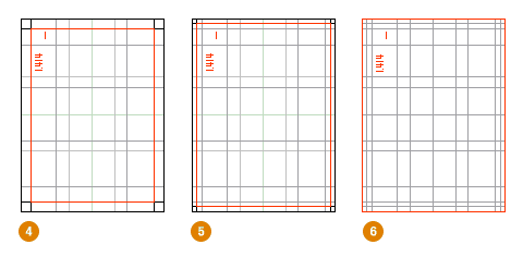
VAN DE GRAAF CANON
The Van De Graaf Canon is a historical reconstruction method that has been used in book design for decades. It works for any page, regardless of its dimensions.

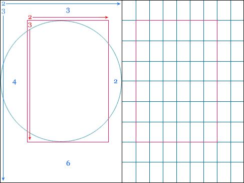
VILLARD DE HONNECORT'S CANON
This canon uses the same basic construction as the Van De Graaf Canon. However, instead of drawing a diagonal line to the opposing intersection point, this diagram uses horizontal lines, and only creates a box on one side of the double page spread.

No comments:
Post a Comment