
CANONS & GRIDS
A grid is like scaffolding for a building, it helps the designer structure elements.
The Van De Graaf Canon is a historical reconstruction method that has been used in book design for decades. It works for any page, regardless of its dimensions.
By using a Van De Graaf Canon you get a perfectly sized text box with the same ratio as the page. Moreover, the boxes are also perfectly placed on the page creating a balanced composition. A well proportioned page will be indented to one side of the document, depending on what side it is for example, the right hand page is indented to the left.

Additionally, by using this cannon you will always end up with a 9x9 grid, which is 1/9th from the top and 2/9ths from the bottom, the size of the page dosent matter as long as the cannon is constructed properly.
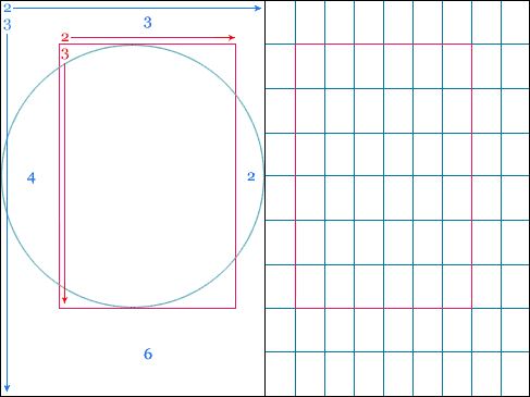
CONSTRUCTION

First, draw diagonal lines from corner to corner to find the middle of the page.

Draw lines from the bottom corners that meet at the center page line.

Where the lines intersect, draw a vertical line to the top of the page. Then where it meets the top of the page draw a diagonal line to the intersection point on the other page.

Repeat this process, and then use the canon to create a balanced page layout.
Moreover, there are different, developed versions of the Van De Graaf Canon that achieve different sized boxes, such as Villard De Honnecort's Canon. It uses the same basic construction as the Van De Graaf Canon. However, instead of drawing a diagonal line to the opposing intersection point, this diagram uses horizontal lines, and only creates a box on one side of the double page spread.

More examples and explanations of some different canons can be found here.
LEADING
Column width is used for more than just aesthetic or format purposes, it is also based on legibility.
Printed text is read by the eye at a distance of 30 - 35cm. According to the empirical rule there should be around 7 words per line for a text of any length. The type are should be light and open in appearance, this can be achieved by using leading.
Leading is the distance between lines of text.
Kerning is the space between characters.

A column is easy to read if it is wide enough to fit in an average of 10 words per line. The key is to have text that is easy to read as the text MUST NOT affect the rhythm of reading. This dosent apply to titles or subtitles.
MARGIN PROPORTIONS
Margins can also have an influence on the feel of the page, if the margins are small it will look like there is too much information on the page.
Well sized margins result in a well balanced page. As mentioned before, the right hand side page will have a bigger margin on the left hand side, an example of this can be seen below.

Well sized margins result in a well balanced page. As mentioned before, the right hand side page will have a bigger margin on the left hand side, an example of this can be seen below.
TASK
Towards the end of the session we started using our new found knowledge of grids to draw a range of compositions.

We were then asked to digitise these in Illustrator.

I found the past two sessions really engaging, as I have an interest in editorial design. In one of my recent projects I created a publication, I came across problems when composing my pages as I found that when I mixed infographics with text the page often looked unbalanced. I think that the use of grids in publication and editorial design is valuable. It helps achieve a balanced composition and also can be used to guide the readers eye across the page. I think it is important for designers to learn how grids and canons are used, as it defiantly helps when designing page layouts. Moreover, now I have an understanding of how the grids work I will start experimenting with rearranging certain elements to generate new compositions.
No comments:
Post a Comment