

First I reviewed my lecture notes and seminar blog posts to define my points of interest.
POINTS OF INTEREST
- Street art.
- History of Type.
To help me decide between the two topics I made a spider diagram of points of focus I could take.


SUBJECT CHOICE
When creating the diagrams for each topic I noticed that the ideas for street art were easier to generate than those for a history of type. Moreover, I also created a much broader range of ideas. I think this is due to the fact that street art and the surrounding culture is in my personal interest. Therefore, I have chosen street art as my choice of subject.
I will now collect a small body of research into street art to help inform the focus of my book.
Next, the general research into street art I collected helped me to define my points of interest within the subject of street art. Therefore, I created proposal development sheets that explore my points of focus and possible directions the outcome could take.

Next, I selected the strongest ideas to develop further. I want to define the message the outcome will communicate, the target audience, and possible forms the outcome could take. I will create design sheets that
- The Importance of Political Graffiti in modern society.
- Understanding Street art.

SUMMARY
- This concept covers a brief history of political graffiti, and its importance to society.
- It will explore the relationship between graffiti artists and their environment, self expression in society, freedom of speech, and what drives street artists to continue creating politically motivated artwork.
- The publication will communicate this through documentary style photography of political street art and the spots artists choose to paint.
- Additionally, the publication will take the form of a small black book, similar to what graffiti artists sketch in.
- The publication will be aimed at young males and females around the age 16 and upwards, but be suitable for a middle aged audience as well.
- I need to think how the stock could reflect the content.

SUMMARY
- This concept covers a brief history of street art.
- It will educate people about the importance of street art and persuade people to reconsider their opinions about its appearance and affect on society.
- The publication will explore the relationship between street art and its effect on society, street art as a form of communication and advertisement, street art and the city aesthetic, Choice of work placement and artist process.
- Images taken for the publication will be of high photographic quality, and capture the beauty of street art.
- I want the publication to be creatively engaging to reflect the skill and precision that it takes to create a good piece of street art.
- I also want to cover street art and its importance to modern society.
- My target audience will cover a range of ages form teenagers to adults, but will focus on creatively aware people who are not necessarily bothered about street art.
- The outcome will take the form of a book.
- I will focus on the balance of type and image when creating the layout for the book. I don't want the pages to be busy so will use a limited amount of type and image on each page.
- I want to explore the function of the book, and have pages that fold out to reveal large images.
I need to make a decision between the two proposals so that I can start collecting primary research for the project. After revising the summaries made from each I have decided to go for the second proposal of creating a book to help people understand the beauty of street art. I have chosen this over the other concept as it focused specifically on political graffiti and collecting imagery for the project would be a problem.
PROPOSAL STATEMENT
The publication will explore a brief history of modern street
art, focusing on works that have been created in the last decade. I intend to
explore the relationship between street art and its benefits to society, street
art as a form of communication, street art and the city aesthetic and politics
and street art. The outcome will be aimed at middle aged people who would
normally ignore street art, or who don’t like it. However, it will also be
suitable for people with a general interest in street art as well. I intend to
educate the audience about street art and its benefits to modern society, and
persuade them to take a step back and appreciate its beauty. In turn, I hope
that the outcome will provoke the audience to reconsider their views, and
understand the beauty and importance of the art form. In order to achieve this
I will produce a hand bound book that uses high quality imagery and the article
to communicate its message. I want the book to be neatly produced and have a
quality finish reflecting the quality of the work that will be featured within
it. Moreover, I want to explore different ways of getting the audience to
engage with its content.
After collecting a body of research into the main topics I want my outcome to
THEORY INTO PRACTICE - PEER FEEDBACK
Today we participated in peer feedback sessions. First the group was divided in to two, then we each took turn to present our initial proposal, and research collected up to this point. After we finished presenting members of the group gave feedback which was noted down on our progress crit sheets.

SUMMARY
- To improve my research I need to collect more secondary research regarding the content of my article. At this point in the project I have defined my target audience as middle aged people who would usually ignore street art, this has defined the content and form of my publication. Additionally, I also defined four points of focus that will be discussed in the article to help communicate the intended message. It was mentioned that to progress I need to further inform myself about these four points of focus.
- I should email street-artists and try to conduct a email based interview. This will enable me to define what street artists think about their work and its effect on society.
- It was stated that my concept is strong, as I have defined my target audience and thought about what I want the publication to achieve.
- I should consider a personalised cover design that is relevant to the outcomes content.
- I mentioned in the crit that I considered printing my outcome on black stock, the group urged me to do this which got me thinking if it would be possible with the amount of time left before the module submission.
RESPONSE
PRINTING METHOD
I mentioned in the critique that I wanted my outcome to be printed on black stock like the 'Rom13 Magazine' I looked at in my research. Members of my group advised me that the digital printers at university cant print onto black stock so I should consider screen-printing my outcome instead.

However, after reviewing the concept of my magazine I have decided against printing onto black stock, and against using the screen print method as;
- My publication will aim to persuade the audience to reconsider their views on street art. It will achieve this by showing them the beauty and importance of the art-form through photography and an informative article.
Therefore, I have made the decision to print onto an off white paper stock instead. Furthermore, the outcome will be digitally printed, so that the printed image quality is high.
- To achieve this the imagery needs to be printed to a high standard, this would be very hard to achieve using the screen-print method.
- Image clarity could also be affected if the images are printed onto black stock.
I also continued to collect a body of research from books and magazines regarding the outcomes content, I focused on collecting information from books supporting my viewpoint that street art is important to modern society.
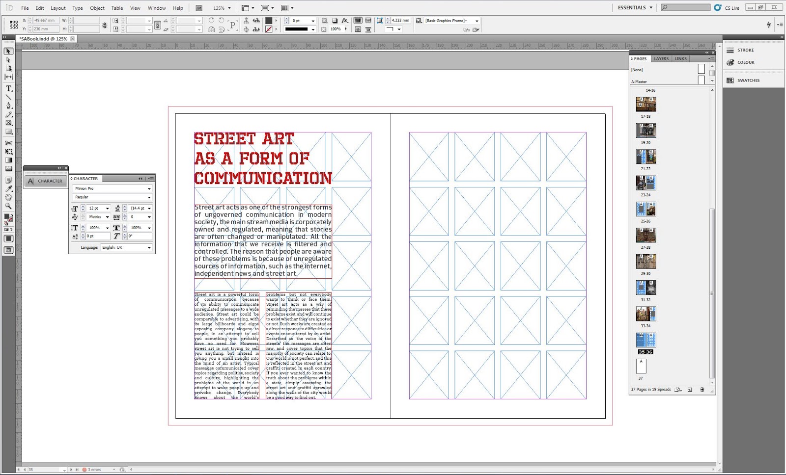
ARTICLE


FINAL WORD COUNT - 3, 307
PAGE ORDER
Completing the article meant that I knew how much text I have to work with, and also meant i could start picking images that relate to specific parts of its content. With this information I started planning my page order.
DESIGN CONSIDERATIONS
TYPEFACES
'Prime' is a simple sans-serif font with a techy feel, its geometric lines reminded me of a lot of the lines found in the typographic graffiti I took pictures of for my primary research. Furthermore, its basic appearance gives the font a formal feel, this is something I want my fonts to achieve as the target audience will relate to formal looking fonts . Additionally, the font is eye catching and works well as a display typeface. The font only comes in two weights, regular and light which is unfortunate as a bold version would have suited the function of a display font perfectly. Regardless, I have chosen Prime as the display font that will be used throughout the publication.
The typeface will be displayed at various sizes from 23pt and upwards. I will use the Fibonacci sequence to help me proportion my fonts correctly.

For my subheading font I selected another formal sans-serif font called 'Collator'. The font has similar characteristics to the 'Prime' because of the angles of certain characters such as the ear of the 'r'. Also the font has an high x-height and wider characters similar to the characters in the prime font, characteristics which help with the legibility of the font. As the fonts have similar characteristics they mix well, which is the reason the font was chosen.

Finally, I needed a serif font for the body copy to ensure that the text is readable at a small point size. Furthermore, the font needs to mix well with the two formal sans-serif fonts chosen as the heading and subheading fonts.
'Arvo' is a geometric, slab-serif typeface that comes with four font variations. The typeface has serifs which will help its readability at small sizes.

Finally, I experimented with mixing the selected fonts on mock up composition to see how well they mixed when placed on the same page.The fonts complement each other, but the typographic hierarchy is hard to define as the heading and subheading fonts are very similar.

Therefore, I decided to choose a different font, that would be more definable as a heading font. I started looking at stencil style fonts as a lot of the street art I was photographing at the time was created using stencils.

I selected 'Octin Prison' as the heading font, the letterers have been created in a stencil style which has relevance to the publications content. Furthermore, the font is all uppercase, so it has more influence on the page and attracts viewer attention.
BINDING METHOD
Multiple signature binding technique.

- Methods stitches together multiple signatures.
- As this binding technique fixes individual signatures together it creates a really strong durable outcome.
- Booklet would be glued into the front cover.
PRINTING METHOD
As previously discussed the outcome will be printed digitally to achieve a high quality printed image.
STOCK - PAGES AND COVER
When collecting research about street art I looked at a book called 'Street Studio' by Alison Young, Ghostpatrol and Miso. When reading the book I found the stock they used gave the book a really nice look and feel.
I want to use a stock similar to this, when compared to a standard sheet of A4 I noticed that the paper is slightly off white in colour. Furthermore, the paper also had a greater GSM that the A4 sheet which has an 80gsm density. I will order a paper that is has a gsm of around 130-150, a slightly thicker paper results in the book feeling quality,a trait I am trying to achieve.

ORDERING PAPER
I ordered paper from a website called 'papercutz', they have a wide choice of paper and their service was fantastic.
I ordered 25 sheets of A2 creme coloured paper as the pages of my outcome is going to be A4 in size. With an added bleed the pages would not print onto a standard a3 sheet, so A2 paper was ordered instead. The paper has a GSM of 160 meaning that it is relatively thick but can still be used in printers we have at college. The thick pages will give the book a quality feel which is something that will benefit the function of my book.


COLOUR SCHEME
I want the colour scheme to reflect the content of my book and article. I thought about having a colourful colour scheme to reflect the vibrant hues found within street art. However, having a vibrant colour scheme could take focus away from the imagery found in the book, therefore I decided against using one.
After reviewing my research I decided to use a grey and white colour scheme, all design elements such as headers and body copy will be rendered in a dark grey. The colour scheme reflects the paint colour used by graffiti removal squads to paint over graffiti and street art. Vibrant, visually engaging pieces are covered by dark grey squares which, in my opinion look much worse than the artwork that they cover.
To reflect this ideology I will also include large grey squares that directly reflect the ones painted by the council.

DESIGN SHEETS
Upon reaching this part of the project I reviewed the details of my concept and research. Next, I created my design sheets, which explore various layout variations for each page. When creating layouts I focused on the flow of the page and how the viewers eye moved across the spread. Furthermore, as my book will focus on my images taken in response to the brief I have experimented with image placement and size.


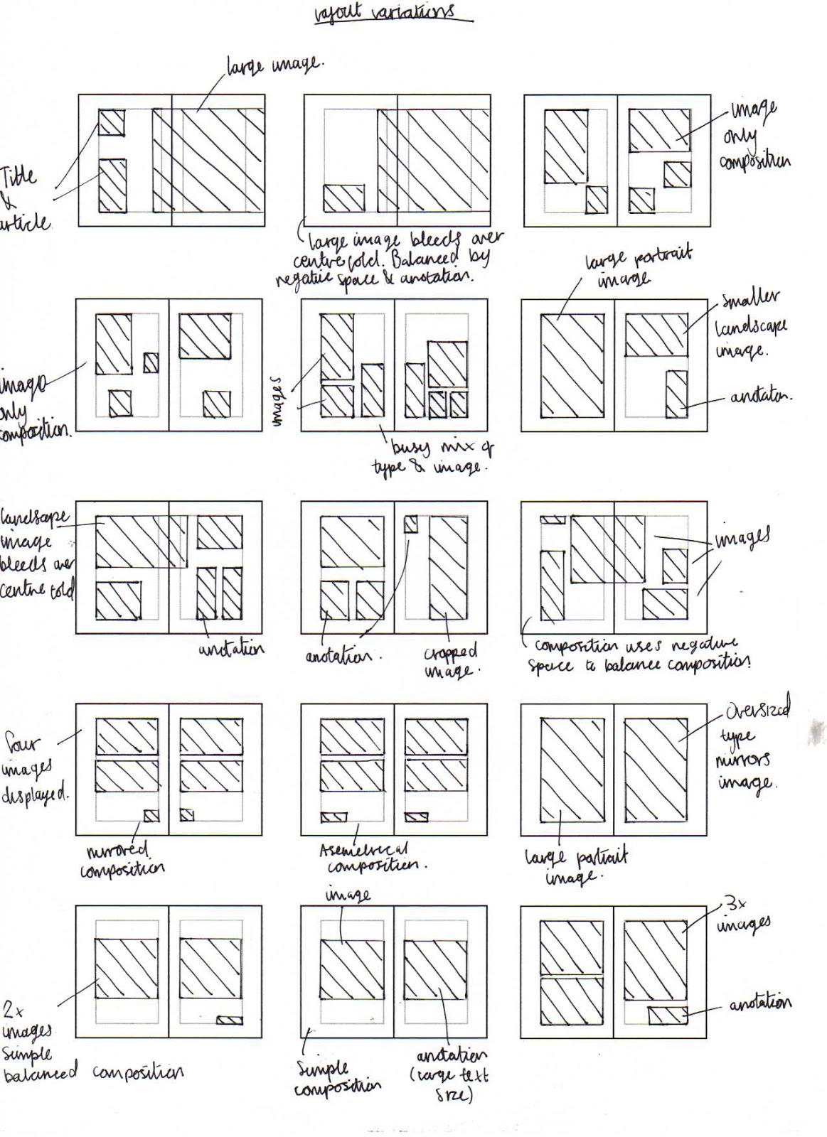
From this selection of layouts I selected the most functional, aesthetically engaging designs to enlarge and develop further.


Once again I reviewed the compositions and refined the designs again. The strongest layouts have a good balance of type, image and negative space. Furthermore, I also looked for designs that guide the eye around the page.
When creating my book digitally I will recreate these layouts digitally and place in my content.


PRESENTATION & FEEDBACK
On Tuesday 16th of april we presented our projects to a small group. The presentations recapped the concepts and showed how much progress we have made since the last critique. At the end of the presentation we were given feedback from members of the group and a tutor. Below are a few select slides from my presentation.


- Firstly, in my proposal I mentioned that the target audience was aimed at middle aged people who dislike street art. It was suggested that I re-think my target audience currently it is very focused. Moreover, the selected audience may not engage with and buy the book in the first place.
- Furthermore, when presenting my photographs I talked about how street art made me explore the city I was in. It was suggested that I should include some maps plotting the locations of public art on a map, this supports my books function and also enabled the audience to directly engage with the art form if they want to.
- Finally, I also talked about the content and focus of my article. It was made apparent that I had become slightly unfocused. The brief states that we explore a 'Brief History of' but in my article I have barely touched on the history of street art, or its development from graffiti.
RESPONSES
- I have now redefined my target audience as people who are misinformed about street art and its benefits to modern society.
- I will include maps plotting the location of street art pieces that I have photographed.
- The article will be reworked.
ARTICLE
PHOTOS
Below are the final set of images, they were taken mostly in London and Manchester, however there are a few from Huncoat power station too. I tried to capture the beauty of street art, so took images of aesthetically engaging work.
When refining my choice of images I read the article at the same time, looking for images that are relevant to the content of the article. I took all of the photographs, so their quality will be high as they have not been taken from the internet, and I will not need to include a bibliography referencing their owners in the back.


MAPS
After the presentation with Fred it was suggested that I should plot the locations of works featured in the book on maps. This links to some of the ideas about street art covered in my article where I talk about how street art evokes people to explore their city environments.
I will number each image of street art featured in the book, then in the back of the publication show their location on a map. This way if the viewer wants to further engage with the concept of the book and see some street art for themselves, they can use the publication to find them.
Luckily I recorded the locations of most of the pieces photographed in the book, so plotting their location accurately on a map was relatively easy.
After the images had been placed and numbered in the book I used Google maps and print screened the sections of the city where I photographed street art. I then dropped the image into illustrator, vector traced the image and added the numbers for each piece of works location.


The maps were produced in grey scale to keep in theme with the colour scheme.
COVER DESIGN
The cover of the publication needs to reflect the content of my article and images. I want the illustration or typography to be eye catching and interesting to look at, this way it will capture the viewers attention and intrigue them to have a look inside.
I produced a spider diagram exploring various ideas I had for the cover design.

I decided to use the stencil idea, focusing on a can of spray paint due to its link with the content of the publication. I produced the stencil by first taking a picture of a can of spray paint I had.


I used Photoshop to adjust the images threshold until I had an image that was recognizable. Furthermore, I made sure that there was a large expanse of black, as I want to fade different colours of spray paint and for this to look good the design needs space.

I used a scalpel to cut out the black parts of the design, leaving me with a stencil of a can of spray paint. I will use thick black stock for the cover and apply the stenciled design to the front of the cover.
DIGITAL DEVELOPMENT


 #
#


PRODUCTION - PRINTING AND BINDING
The publication was printed in the digital print room at university, the prints turned out really well, the ink took to the off white stock well and the smooth matt finish gives the book a quality feel.
I used a metal ruler and scalpel to individually cut out the pages of the book. After I had completed this I used the bone folder to neatly fold the pages.
The pages were then placed into a single signature, due to the thickness of the book there was excess left by the centre pages which made the book look untidy, so these were trimmed off.
Using a needle and thread I then bound the pages of the publication so they were ready to be glued into the front cover.

When making the cover I used the stencil that I had previously made. I stuck the cover and stencil down using masking tap so they couldn't move when the spray paint was applied.

After leaving the cover to dry I prepared the back of the book for an application of spray paint.

I used a variation of three colours for the fade, a deep purple, blue and light blue. The darkests colours were applied first fading into the light blue, then I added white speckles on top of the fade to achieve the desired effect.


Finally, the bound pages of the book were glued into the cover. To ensure the pages did not move during the drying process I used a bulldog clips to hold them together.
FINAL


EVALUATION
Firstly, upon receiving the brief I was relatively quick to choose my point of focus as street art. I found the lecture really engaging as street art has been something I have been personally interested in for a while. Defining my point of focus quickly enabled me to spend a lot of time developing a strong proposal for the book.
After defining my proposal I started my research, I used internet sources to look at information regarding the history and evolution of graffiti. Due to misreading the brief I initially did not focus my research on the history of street art, but instead on the points I would used in my article to persuade them to reconsider their views on the art-form. It was not until the presentation critique with Fred that I realized I should have put more focus on the history of street art. In future I need to thoroughly read the brief to make sure I know exactly what needs to be produced. I overcame the problem by rewriting the article so that it included a brief history of street art, which also helped evidence some of the points made later in the article.
I made it clear in my proposal that I wanted to take all of my own photographs. Therefore, for my research I planned trips to various locations around the country to collect images of street art. After visiting locations in Leeds, Manchester and Huncoat I realized that I had a large quantity of photographs of graffiti, but only a handful of street art. To really engage the audience I needed to show good examples of modern street art, so I arranged a trip to London. In London I managed to collect most of the images needed for my book, I was able to photograph works created by come infamous artists that really define the movement. All images where taken in raw format and edited in Photoshop, this enabled me to achieve a high quality image for my outcome.
After collecting a range of visual and informative research I started producing thumbnail sketches of different layouts I wanted to use in my publication. Firstly, I produced a range of small thumbnails, these were produced quickly and explored layout and played with the balance between type and image. After producing a range of these I reviewed and refined the designs, the stronger designs were chosen and developed at a larger size, this allowed me to make improvements to the composition. Finally, I reviewed and refined the developed thumbnails and selected a range of final layouts that were used to help with the composition of my pages. This process helped me develop a series of strong page layouts, each balances negative space with type and image to achieve a balanced composition that is pleasing to the viewers eye and easy to read.
Once I had a range of layouts, all the images and the article I started digitally producing the book. This was a relatively quick and easy process as I used the layouts to help me when composing each page. Furthermore, I had previously defined all design decisions regarding fonts and colour.
Due to bad time management I did not have time to print a model of the book, which would have allowed me to check for mistakes and practice binding the book. Instead I had to print the publication without making a model beforehand. Furthermore, before heading to the print room to print the final copy of my publication I noticed a large problem with the format of the whole document. The pages were sized at A5 instead of A4, to correct the mistake I would have needed to adjust the page dimensions to A4 and then resize all the content and images individually. Unfortunately due to bad time management I did not have time to resize the document so it went to print with a final page size of A5.
The book was printed onto the stock I ordered off the internet in the digital print room at college, the inks took really well to the paper and the print quality was really high. Unfortunately, the book was printed using the wrong binding method, therefore the pages were printed in the wrong order for if the book was to be bound using a multiple signature binding method as outlined earlier in my project. Due to a lack of time before the deadline I unfortunately could not re-print the book. As the wrong binding method was used, when the excess pages were trimmed they cut right down the page numbers in the centre of the book, this looks really unprofessional and is a problem I could not correct before the final hand-in.

Furthermore, as I continued to look through the book I spotted another mistake, the font was sized too large on the final text page of the book. This is another mistake that could have been avoided if I had managed my time better and produced a model of the publication before printing the final copy of the publication.

Finally, after the spray paint on the cover had finished drying I applied some PVA glue and attached the booklet. Despite the mistakes which I cant bare to look at, I am really happy with how the book turned out. However, I think that I am going to amend the mistakes and reprint the book for my portfolio.
FINAL (FINAL) IMAGES
(add final images)
No comments:
Post a Comment