
Firstly, we started the session by presenting the information we had previously collected for the session. My group presented the class with information on Grids, Columns, Margins and Gutters.
Below is the information I collected.
Below is the information I collected.
Grids - Grids are used by designers to help organise the contents of a page, they help achieve a functional balanced design.
Columns - Columns are the sections where type is placed.
Columns - Columns are the sections where type is placed.
Gutters - Gutters are the spaces left by the columns. Moreover, the space left in between pages for binding can also be referred to as the gutter.
Margins - Marigins are the spaces left around the primary text frame.
After we finished presenting I took notes regarding the meanings of the words the other groups covered. Moreover, My notes formed the basis for further research into certain words that I felt like I didn't fully understand.
After we finished presenting I took notes regarding the meanings of the words the other groups covered. Moreover, My notes formed the basis for further research into certain words that I felt like I didn't fully understand.
Subheadings - A subheading is a heading given to a subsection of writing. The subheading is smaller than the heading but larger than the body copy.
Paragraphs - A paragraph is a section of writing.
Images - Photographs, illustrations, drawings.
Captions - A title or brief explanation appended to an article, illustration, or poster.
DPS - Digital Publishing Suite, such as Adobe InDesign.
Drop caps - Drop caps is when the first letter of a piece of text is larger than the rest of the text.
Headlines - The title at the head of the page.
Rules & Boxes - Rulers are used to measure, both physically and digitally. Boxes are used in programs such as InDesign to place elements like text and images in.
Folio Numbers - The practice of placing a number on each item in a paper file so that items within the file are easily identifiable
Pagination - Is how the eye reads across the elements on a page.
Imposition - Imposition is the order of pages when binding a book where the leafs are placed on top of each other and the binded. For example the first and last page of the document will be printed on one spread.
Ligature - Two or more characters that are combined to make type look more attractive and legible, also used to represent phonic sounds.
Pica - Measurement used in typography.
Pixel - Sample of an original image.
Point - Unit of measurement used to measure type. Measures the x-height of the letter rather than the height of the letter.
Drop cap - Large capital letter placed at the start of a chapter, also used to signify a break in text.
PEER FEEDBACK
Next, we participated in a peer feedback session. We got out a piece of work that we wanted feedback on and left it on the desk, we then walked round the class and reviewed everyones work. It is important to ensure that any feedback given isn't overly critical but constructive, I started my feedback by listing the positives and then made suggestions as to what could be improved after.
I chose to recieve feedback on my cheetah article instead of my '10 things' book, as this project is at a better stage to be reviewed.
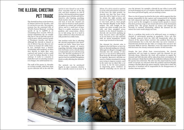
Below is the feedback I received, it is all very positive but not very constructive.
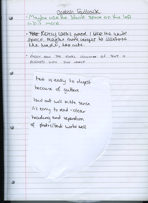
I am happy that my design is well received but it would have been good to have some constructive feedback. In future feedback and critique sessions I will remember that I when am giving feedback it is important to balance both positive and critical comments.
No comments:
Post a Comment