Below are a selection of letter forms I created
Additionally, I also created more letterforms when I arrived back home, spending more time on them enabled to me create more refined letters.
The task requires me to make an A, B, C, X, Y, Z both upper and lower case for five of the letterforms I have created. Moreover we also have to give the fonts a name, I also plan to produce a typeface from my favourite set of letterforms.
First I produced the letter A that I created at home, the letter mixes the bold elements of Gabo drive with the serif features of Constantia creating a contrast that is the reason I like the letterform. Furthermore, I think that the letterforms created will be interesting as they mix serif and sand serif letterforms.
Using the methods covered in lesson I carefully coloured the letters black.
After I completed colouring the letters I decided to also make a digital version of the letterforms. I first compared the two letters at 72pt, the letter 'A' from the font Constantia was slightly smaller so I rescaled it so the height of the two letters was the same.
I then used a combination of the pen tool and pathfinder to subtract parts of each letter.
Placing the letter parts together I added a cross bar and had my first letter completed. I used the same technique to create all of my letters which can be seen below.
Next, I decided to select a letterform that was very curved. My next letterform combined the boldness of Gabo Drive and the round bowls of Constantia. The overlap of the bowls is an important feature that I want to focus on when creating the font.
When producing this font I want to focus on using curved lines for the cross bars and bowls of each letter. After creating the letters out of dissected letter parts I sketched out the 'ABC' & 'XYZ' both upper and lower case on an A3 sheet.
After, I had documented the outcome, I used illustrator to help me digitize the font. Using the pen tool and the pathfinder I deleted elements of the existing letter I did not need.
I experimented with using the bowl from the letter 'B' of the Constantia typeface. However, I chose not to use it as the curve was not evenly spaced. Therefore, using the pathfinder tool I made a circle to use instead.
I continued to use the same technique to produce my font, using a circle instead of the bowl from constantia.
'Harold' Font
Next, I focused on quite a formal letter, it is a simple serif font meaning it would be most suitable for body copy. When creating the letter I experimented with varying the bowl size of the letter to create its new form.
After creating the letters out of dissected letter parts I sketched out the 'ABC' & 'XYZ' both upper and lower case.
Next, I scanned in the sheet and used illustrator to help me digitize the font.
'Kevin' Font
Next I produced one of my favorite letter forms created in Fred's lesson. The letter form shows a good balance between bold and regular. Moreover the letter forms also mixed two contrasting styles of type, Rockwell Ultra Bold and Mission Script, the contrast in size and style couldn't be more different. Happy with the initial results I decided to produce the full alphabet. My design process can be seen below.
After reviewing the initial design of the letter forms I created an A3 sheet of sketched letter forms.
After the sheet was finished I developed the font further on Illustrator. As i like the style of the outcome I will produce the whole uppercase alphabet. I chose to produce the uppercase as the lower case letters don't work as well, this is because they usually link up to the next letter. However after the letter adaptations have been made the font doesn't always work this way.
I soon discovered that making this font was going to be a lot harder that the first three letters had been. Some of the letterforms just don't work due to the difference between the strong bold features of rockwell and the dainty aspects of Mission Script. I think because of this overall the font doesn't work that well. Moreover, I struggled to put the font into context due to its unusual characteristics.
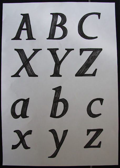
Finally, as I am not pleased with my the outcome of my last alphabet, I want to make another. I found the perfect letter form in the A that I created at home. The letter mixes the fonts Gabo drive and Constantia to create a clean formal looking serif letter.
Next, I sketched the upper and lower case 'ABC XYZ' of the letter form on an A3 sheet. It was mentioned on the brief that we should explore the letter forms this way first.
I then produced the alphabet in illustrator, working with the program meant I could produce the letters quickly and accurately after rescaling the letters I used the pen tool and path finder to remove elements of the letters I did not want.
Using the parts left from the letters I produced my letterform. Moreover, I copied the serif from the Constantia letter A and reversed it to be used at the bottom of the Gabo drive stem.
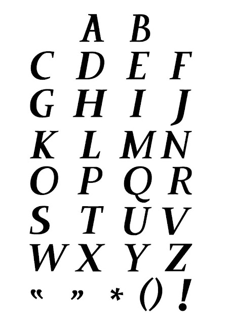
I used the same technique for the serif located at the top of the letter. I used the same methods of production to produce each letter of the font, due to the angles used on the letter A I decided to produce the rest of the letters on an angle so the look italic.
'Arthur' Font
I think that this font would work well as an italic display font, to be used in editorial magazines, and advertisements. This font works the best so far as it can be used in context for a range of things. Therefore, I will produce the whole alphabet and glyphs.
REFINEMENT
After reviewing the typeface I decided to change the letter 'A' so that its angle works better with the rest of the letters.
Currently, the letter looks like it has been inverted when placed next to the others.


No comments:
Post a Comment