
Showing posts with label OUGD503. Show all posts
Showing posts with label OUGD503. Show all posts
Wednesday, 23 April 2014


Sunday, 30 March 2014
DESIGN PROCESS - RESPONSIVE - BRIEF TEN EVALUATION
The last and final brief of the responsive module came in
the form of another live brief, set by a friend who is currently focusing on
setting up his own recruitment firm. As the business is still in the early
stages of development only a logo design is initially needed. However, as the
business grows there could be further opportunities to become involved with the
company branding and identity.
Project research was collected in the form of sit down talks
with the client where he explained the nature of the business and discussed
some basic ideas. After our first discussion I felt I understood exactly what
the client was asking for and so developed a range of refined modern logos. The
concept created to reflect the nature of the business was based around the
aspect of finding the right person for the job, this was visually communicated
through simple graphics depicting jigsaw pieces and dot assortments. During the
first talk it was outlined that the client wanted to apply an inviting pastel
colour scheme to the logo, therefore I also defined a basic colour scheme that
can be applied to any future outcomes.
Once I had created and refined the logo selection I arranged
to have another sit down meeting with the client to present the current
outcomes. The on-going client talks are very beneficial to my design practice
as they help me gain experience with interacting first hand with clients and
discussing design related ideas with people who have no knowledge of design.
The client outlined a logo selection that he wanted to apply to the business
card but also asked if he could utilise some of the simple typographic variations
for the website he getting developed.
The brief is currently still on-going as the client has
asked me to design some aspects of the website as well as the logo.
Furthermore, as the business grows and starts to turn over a profit I want to
propose the design of a cohesive branding and identity project.
Thursday, 27 March 2014
Wednesday, 26 March 2014
DESIGN PROCESS 2 - COLLABORATIVE - BRIEF ELEVEN - REGISTRATION
When submitting my 'National Trust' campaign for the D&AD design competition I encountered multiple problems and a large amount of stress as I was not completely prepared for the submission. Although all work and design boards were finished I hadn't logged in and reviewed the submission process which turned out to be complicated and time consuming.
I want to avoid a similar situation when submitting work for the collaborative project, and so as the deadline for the competition approached I made an account and reviewed the process of submission.
REGISTRATION


THE SUBMISSION PROCESS
In light of my stressful D&AD submission I also decided to review the submission process so that it is easy to understand and complete when the project is ready for submission.


Similar to the D&AD submission when submitting the project a collection of information must be detailed, having the supporting information statements ready before the submission will help to save time when entering work.

I also reviewed the rules of submission again to ensure no aspects of the project could break any of the entry rules;

REGISTRATION CONFORMATION
Below is the conformation email I received after registering my account.

Friday, 21 March 2014
DESIGN PROCESS - RESPONSIVE - BRIEF NINE EVALUATION
After posting some of my recent projects on Facebook I was
approached by a friend who wanted a logo for a hypothetical cannabis dispensary
company. The live brief simply asked for a logo based outcome featuring
typography reading the company name ‘KarmaCrops’, with an accompanying icon
relevant to the nature of the business. I decided to engage with the project as
it presented me with the chance to add another live brief to my responsive
module and gain further experience in logo design, an aspect of my practice
which has been previously outlined as an area for improvement.
The brief was very open with regards to the form and
aesthetic of the outcome as the client only specified that he wanted it to
balance both type and image. Therefore, I digitally developed a range of simple
logo designs focusing on the recognisable form of a cannabis leaf. To ensure
the aesthetic was consistent and relevant with the cannabis based theme a
colour scheme consisting of a variety of green hues was defined.
Before sending the initial logo variations to the client I
went through the collection and selected a assortment of my favourite designs,
this decision was made to ensure the client was not overwhelmed with choice when
reviewing the variations. After reviewing the initial logo selection the client
made a hasty choice outlined a design that he wanted as the final logo. Once
the individual design had been selected a file containing both print and screen
based logo variations was created and disseminated to the client.
No problems were encountered while completing the brief,
however an area for improvement lies with the dissemination of work. While
putting the logo pack together I had to write-up a detailed guide as to how the
logos should be applied, in future projects I want to include brand guidelines
as part of the outcome so that the clients have a document that can be referred
to when using the logos.
Thursday, 20 March 2014
DESIGN PROCESS - RESPONSIVE - BRIEF TEN
LIVE BRIEF INFORMATION
I was recently approached by one of my friends called Jake Slater who is currently in the process of setting up his own recruitment firm. His company will specialise in working with local businesses to find them suitable employees for any job opportunities that they have. Often, businesses do not have the spare time to conduct numerous job interviews until they find the right person for their team which is where Jake's firm come into play. His company offers businesses a service that finds them the right person for the job without the hassle and expenditure of doing it themselves.
As a new business the company needs a recogniseable identity that reflects their service and professionalism and so Jake has asked me to help him develop a company logo and a set illustrations to go on the businesses website. The illustrations created will be featured on the company website and represent the varying business packages the company will offer.
Although there is scope for a complete branding and identity project for the company the client simply requested the logo and illustration outcomes. Personally, I believe that a complete cohesive identity would benefit the company in making it come across more professional and inviting. So, although the client is currently looking for no further work I plan to propose a complete branding project with supporting explanations detailing why the company would benefit from the additional work.
During our preliminary talk the client gave me some basic ideas he had in mind for the logo;
- Simple form - maybe just type.
- Propose some icon style logos too.
- The icons should represent the company - selecting the right person for the job.
- Pastel colour scheme.
- Graphics created need to be simple, modern and recogniseable.
The client also gave me a website he found very inspiring which can be seen here;
Website Link - Link
INITIAL IDEAS
After reviewing the brief details listed by the client I started generating logo ideas through the use of a mind-map. Once complete, I reviewed the information generated and highlighted ideas that had the most relevance to the company the logo will represent.

HIGHLIGHTED IDEAS;
- Crown - best/king, links to hierarchy.
- Magnifying glass - Searching for employees.
- Ticked box - Right person for the job.
- Cog in machine - Right person for the job.
- Jigsaw piece - Right person for the job.
- Hands shaking - Deal sealed, professional.
DESIGN DECISIONS
Next, before progressing with the project and creating some logo variations I first had to define the relevant design decisions such as the colour scheme and typefaces that will be utilised when digitally creating the outcome. When talking with the client he gave some rough feedback as to the kind of aesthetic he wanted to create which helped to influences the decisions made.
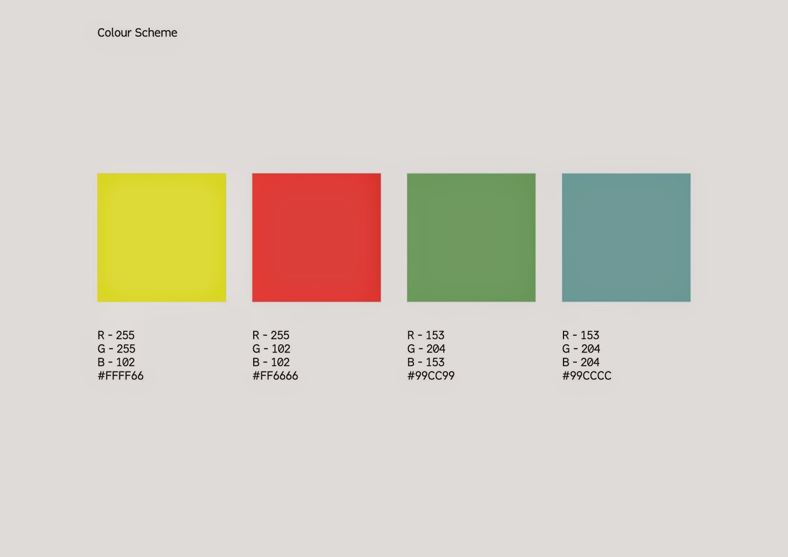
COLOUR SCHEME;
When talking to the client about the specifics of the work he wants creating it was mentioned that he wanted to utilise a pastel colour scheme to create a friendly aesthetic. Therefore, when selecting colours I chose a collection of bright, inviting colours similar to the ones utilised on the Heckford Advertising webpage that was sent to me as inspiration. By selecting a range of pastel colours I can ensure that my outcome achieves the desired look described by the client.
The image below shows the chosen colours with the supporting RGB colour codes.
TYPEFACES;
FONT CHOICES;


CHOSEN TYPEFACES;
From the selection of typefaces initially outlined for the project I decided to refine the selection to a final two fonts that will be applied to the logo variations during the digital development stages of the project. One of the reasons I chose to do this was to ensure that the client was not overwhelmed with choice when selecting a logo from the variations presented.
Typeface One;
WHY CHOSEN;
- Balanced letter proportions make the font both legible and readable.
- Simplistic appearance applies to aesthetic choices outlined by the client.
- Formal appearance of the typeface is professional yet inviting.
Typeface Two;
WHY CHOSEN;
- Balanced letter proportions make the font both legible and readable.
- Simplistic appearance applies to aesthetic choices outlined by the client.
- Formal appearance of the typeface is professional yet inviting.
INITIAL DESIGNS
Using the mind-map of ideas initially created for the project as inspiration I produced a quick set of hand-drawn logo variations. From this selection I chose around five logo forms to develop digitally.

- Develop typographic logo variations using outlined typefaces.

- Develop dot logo - Represents finding the right employee.
- Develop jigsaw logo - Represents finding the right employee.
- Develop crown logo - Illustrates that the company is the best - hierarchy.
- Develop magnifying glass logo - Links to searching aspect of the job.

- Develop medal logo - Illustrates that the company is the best - hierarchy.
DIGITAL PRODUCTION
Once I had designed and refined a range of thumbnail logo variations I continued progressing with the project by digitally developing a range of variations with the outlined fonts and colour scheme.
Once I had designed and refined a range of thumbnail logo variations I continued progressing with the project by digitally developing a range of variations with the outlined fonts and colour scheme.
Type based logo variations;

Medal & Magnifying glass logo variations.

Dot logo variations;


Jigsaw logo variations;


Crown logo variations;


FINAL DESIGN SHEETS;
After creating a large range of logo variations I arranged to have another meeting with the client to discuss the projects development so far. Before attending the meeting I reviewed and refined the selection of digital logos creating logo sheets to display to the client while discussing ideas. The creation of these sheets is an essential part of communicating with the client as they allow me to present a selection of refined ideas while explaining the relevance of each one.
The images below display the sheets presented to the client;
CLIENT MEETING
At the meeting with the client I sat down with my laptop first displaying the two font choices and colour scheme. After presenting the fonts and chosen colour scheme to the client I progressed to present and explain each logo design, talking about the aesthetic decisions made and their relevance to the company.
During the meeting any important points of feedback were noted down and recorded so that I could assess the points covered at a later date.
NOTES;

- Colour scheme perfect - just what the client imagined.
- Bebas font preferred due to weight variation.
- Both dot and jigsaw icons were a big success with the client.
- Fabrica font preferred from font selection.
- The outlined colour scheme will be applied to the website.
- Send outlined logos with changes made to client asasp.
RESPONSES;
After reviewing the list of notes taken during the meeting with the client I formed a list of responses to help me progress from the meeting;
- Prepare colour scheme with supporting RGB colour codes for web developer.
- Bebas font was liked because of the weight version but Fabrica font was preferred from the two - develop weight variation for Fabrica font.
- Put together logo pack with outlined logo variations.
SENDING FILES
During the meeting with the client it was outlined that he wanted the variations discussed sending to his email address as soon as possible. I was informed that he was meeting with a web developer named Alex to discuss the specifics of the company website and wanted to take the colour scheme information and logo to him for visual references. Therefore, after preparing the colour scheme and making the outlined changes to the Fabrica font I put together a logo pack containing all relevant files.
Dropbox was used to disseminate the logo file to the client as the program allows users to store and download multiple files online and distribute access links to people of their choosing. Due to these characteristics the program is perfect for sending work to clients.


Supporting the logo file disseminated via dropbox I also composed an email which was sent to the client explaining the specifics of the folder and files contained within.

PROJECT ON-GOING
Despite the end of the responsive module the live brief is still on-going as I am working on producing a series of illustrative icons for the clients website.
Over the summer I hope to arrange another meeting with the client in which I will propose my further involvement with the companies branding. As mentioned earlier in the post, the client is currently not looking to develop a complete cohesive company identity. However, I am hoping that my proposal presentation will change this view.
Subscribe to:
Posts (Atom)