PRINT EVALUATION
Firstly, I
believe that my outcome successfully solves the problem of providing users with
supporting information about the six stages of the print process. The guide
divides information into easy to navigate sections that cover each stage of the
print process in fine detail. Users can then refer to the specific area they
are having a problem with to find the information key to the success of that
specific stage of the process.
Looking
back, an aspect of the project that I would improve would specifically relate
to the amount of time spent on the project. As the outcome is very content
heavy creating a balance of informed information and supporting visuals
consumed a huge amount of my time, and consequently affected my time management
for other projects. In the future, I will make sure that I plan my project
timescale better, and create solutions when I notice that areas of a project
are taking too long to produce. Doing so will enable me to identify when I am
falling behind with work and provide me with the means to create a solution.
WEB EVALUATION
Firstly, I
believe that the project was an overall success, the outcome effectively
achieves the aesthetic profile that I wanted to create, making the website
appealing to the target audience outlined earlier in the project. Additionally,
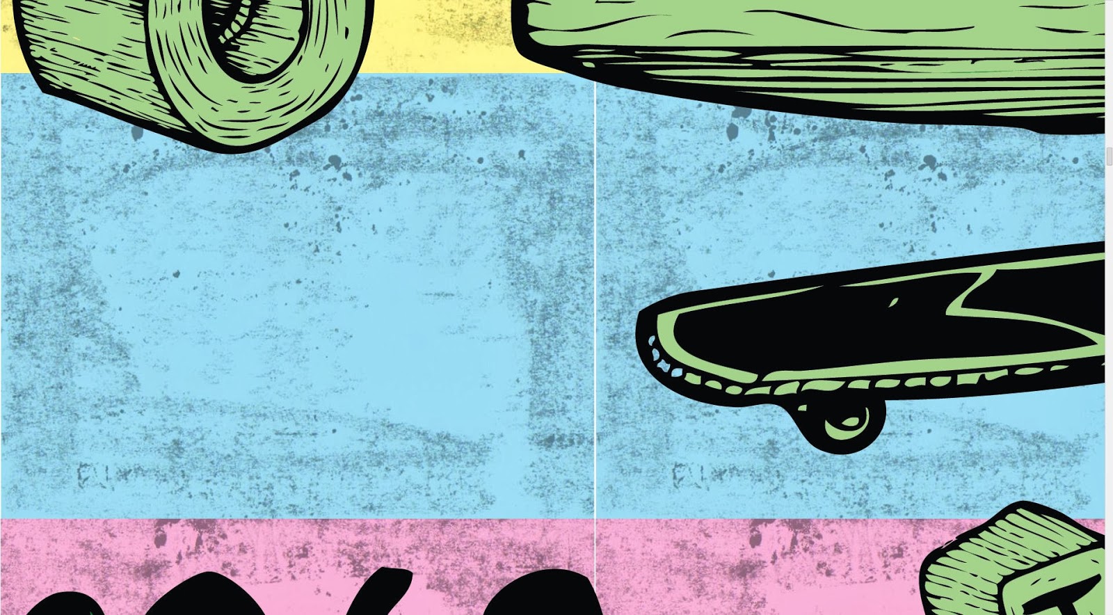
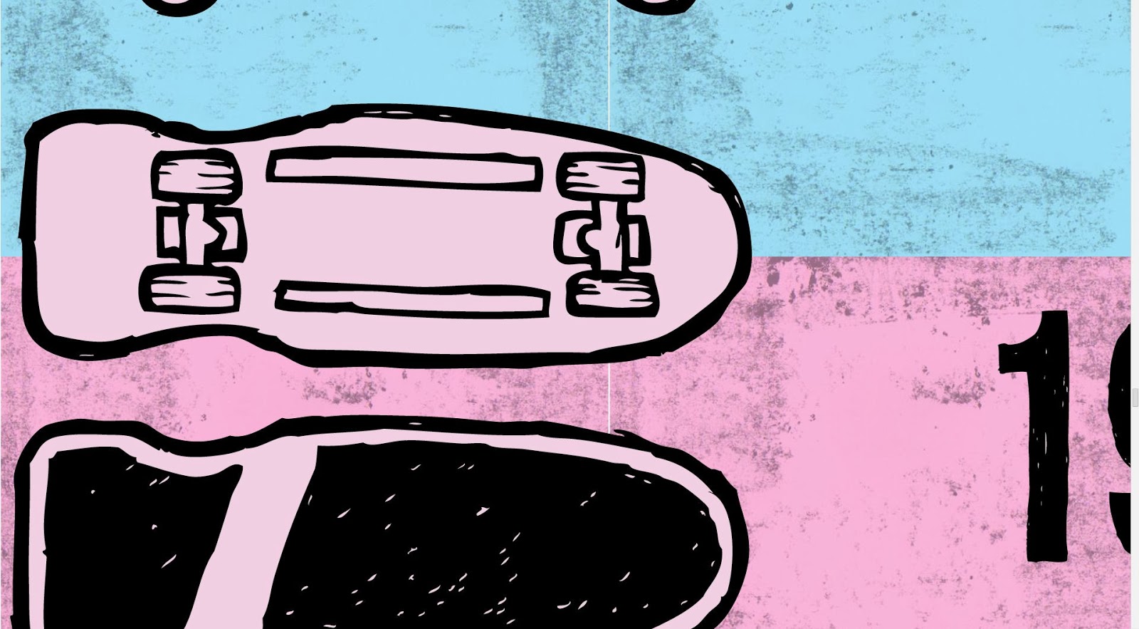
the organisation and presentation of information was also successful. It was mentioned in one of the critiques that
to completely engage the young audience outlined the content of the site would
have to be image heavy, and to a certain extent rely on the images/illustrations
to communicate the content. Once I had finished organising the content for the
book, I immediately outlined important aspects of skateboardings history and
created a hand-rendered illustration to support the snippet of information. The
process was very time consuming and later, combined with an under-estimation of
timescale for another project, came to seriously affect the time management of
the project.
Areas of
improvement relate specifically to the coding aspects of the website and time
management. I found the coding side of the project very challenging, and
consequently could not create the website to anywhere near an acceptable
functional standard. Additionally, the problem was not helped by that fact that
I under-estimated the timescale it would take to complete certain aspects of the
project, leaving me in a position where I had a huge task I couldn’t comprehend
to complete in a short timescale. The results obviously reflect my failure to
understand the basics of coding combined with a lack of time to devote to
learning the coding process in more detail.
In response
to the project’s completion I am going to devise a time management plan that
enabled me to organise my projects much more effectively, leaving time aside to
deal with problems like the one mentioned above. A quote from Fred Bates reads;
“On this course we drown you with work, it’s your job to learn how to swim”.
For me, I think that this statement reads true, specifically for this module, I
set myself three substantial projects and unfortunately could not organise my
time effectively enough to complete them in the timescale set.
PRINT & WEB EVALUATION
Firstly, I
believe that the project successfully solves the problem of providing the
target audience with a solution to the lack of space for growing plants in an
urban environment, where usually there is a lack of space to grow. By providing
users with an information pack that directs the construction of a Windowfarm
growing system, I have given users the answer to the problem of quick, health
and accessible city growing.
Early on in
the project I decided to brand an already existing company after discovering
that they had produced and designed a product similar to one of my initial
concepts, but had developed it to a much higher, informed standard that would
have taken me months of product development to achieve. Therefore, in re-branding
the non-commercial aspect of their company provided me with a platform of
information as to which I could then apply to successfully solve the problem
set by the brief.
The
aesthetics of the integrated outcomes revolve around a natural theme, the
colour scheme reflects the colours that the viewer will encounter when growing
their own food and the illustrations replicate detailed, etching style
illustrations to create textured, engaging visual props to grab the audience’s
attention. I believe that the projects overall aesthetic appearance is
successful because of its consistency across all proposed platforms. This
consistency was achieved through the application of the same colour scheme,
typefaces, illustrations and stock across all outcomes, and helps to form the
strong and professional aesthetic appearance viewers perceive.
Overall, I
believe that the project was a success. The outcome clearly solves the problem
outlined by the brief and successfully applies a consistent, engaging aesthetic
to support information communicated to the audience. One area that I would like
to have improved once again was my time management, although the project ran
relatively smoothly, due to the poor management of other projects I was unable
to propose an advertising campaign. The proposed campaign would have rounded
the project off perfectly, supporting the other platforms of the project by
raising awareness of the cause and direct members of the target audience to the
re-designed website. Other than this, I would have liked to develop some of the
page compositions in more detail, as I personally believe that’s some of the
page layouts in the information guides could be applied to create a more
successful, balanced composition.