At the start of the session we were asked to get into the same groups that we presented our initial concepts to last session. Each group had around ten minutes to present the current progression completed since the last project presentation.
During the last session we presented our research and possible directions the project could be taken in. As the projects success largely relies on a creative, functional concept we devoted extra time to developing ideas. Therefore, to the critique we took a large range of initial concepts that explore the form and function of possible designs and selection of physical mock-up versions of our favorite concepts.
A selection of the mock-ups presented.
After presenting, members of the group gave verbal feedback regarding our projects progression and current success.
INITIAL FEEDBACK
I took note of any verbal feedback that we received;
- Be careful to watch the scale of the outcomes, they need to be big enough to function but small enough to fit onto a desk.
- We have developed a strong start to the concept and have a good potential range of outcome developed - the project is heading in the right direction.
- Consider the packaging in more detail - how will the outcome be distributed?
After the initial presentations were completed we swapped projects with another pair from the critique group, critiqued their work in more detail and outlined a list of things that we would personally do differently if we were completing their brief. Moving anti-clockwise we got Danielle and Sam's WPP - environmental brief.
The pair had a string overall project, both the concept and target audience were well thought out and justified. However, some visual aspects of the project relating to colour schemes used and typography could be improved with some small adjustments. Our comments naturally reflected these criticisms in a constructive way.
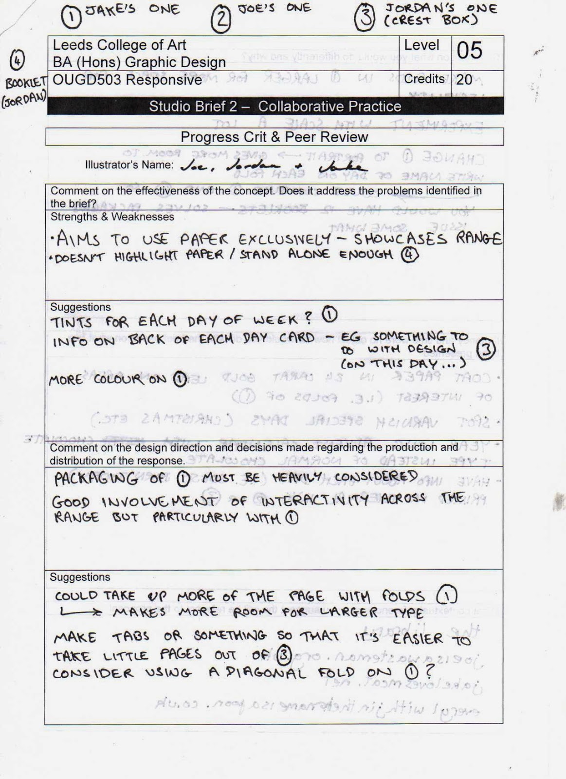
Below is the feedback that we received during the second half of the criticism;
FEEDBACK & ANALYSIS
Below I have made a list of what I believe to be the most definitive aspects of the feedback we received;
Doesn't highlight paper/stand alone enough - booklet idea;
- The booklet doesn't showcase the paper - main focus of the brief.
- Although functional lacks aesthetic quality.
Tints for each day of the week - Jake's design;
- Idea relates to the functionality and aesthetics of the design - coloured tabs would help with the navigation of days and create an colorful aspect of the design.
Information on the back of each day card - Fedrigoni Logo calendar;
- On the current mock-up of the Fedrigoni logo idea the back of the logo shaped sheet (displaying the date) is blank. Feedback suggests that it would benefit from the addition of relevant information on the back of each sheet.
Packaging must be well considered - relates to all possible outcomes;
- Another thing that was mentioned that I believe to be very important was the idea of packaging. The final idea that we choose to develop needs to have supporting packaging suitable for both display and distribution purposes.
Tabs for the Fedrigoni logo calendar are needed to help maneuver pages;
- Feedback relates to the functionality of the concept - would need improving if selected for development.
Make folds larger to make more space for type - Jake's design;
- Relates to the functionality of the design - problems like this should be solved during the developmental stages of the outlined designs production.
Change the form of Jake's idea to portrait, uses less desk space;
- This comment relates directly to the functionality of the outcome in relation to the environment in which it will be displayed. As the outcome is being designed as a desk calendar it needs to be the right size as so it doesn't take up too much or too little space.
ACTION PLAN
Finally, after reviewing and analysing the feedback we received during the session I created an action plan to help us stay organised while progressing from the criticism.


No comments:
Post a Comment