Recently I was approached by a friend with an opportunity to add another quick logo based brief to my collection of responsive projects.
He approached me on Facebook asking if I could produce a simple logo for a hypothetical company he has been thinking about. In light of the decriminalization of cannabis in countries around the world he believes that it is only a certain amount of time before Britain also jumps on the bandwagon and decriminilises the substance. Once this happens, he says the people who are first to open cafes and shops selling cannabis related commodities will make a lot of money, and so the logo is for a hypothetical cannabis company.
Upon discussing the details of the project I was informed that the client wanted the logo to be quite simple balancing a relevant icon with supporting typography. Additionally, I was also informed that the client was willing to pay for the outcome which is useful due to my on-going financial strains.
INITIAL RESEARCH
After receiving the brief I started the design process by collecting a brief body of research into cannabis culture. Collecting the information helped to inform me of any specifics that could help influence the logos aesthetics and form.
Research Link - Link
INITIAL IDEAS
Collecting the research helped me to understand the various aspects of cannabis culture, from the appearance of a cannabis plant to the methods used to smoke it. After becoming versed with the cultures specifics I felt informed enough with the subject matter to start generating ideas for the logo.
The mind-map below documents the ideas generation process;
IDEAS TO DEVELOP;
- Leaf - visual representative of culture and plant.
- Bud - visual representative of plant.
- Smoke ring - produced while smoking, smoke trick.
- Bong - used for smoking substance.
- Joint - used for smoking substance.
- Pipe - used for smoking substance.
DESIGN DECISIONS
After defining some initial ideas for the logo I started progressing with the project by defining the colour scheme and typefaces that will be applied to the logos during the digital development process.
COLOUR SCHEME;
When selecting a colour scheme I wanted to choose a range of colours that visually represented the nature of the company. While collecting research into the subject matter I came to understand that the colour green is very important to cannabis culture and could even be seen as a visual representative of the movement. Therefore, as green is such a relevant colour to the subject I decided to base my colour scheme around a selection of green hues.
As the logo would be used for both screen and print based media I listed both the CMYK and RGB colour codes;
TYPEFACE;
When it came to selecting a typeface I was initially going to look at fonts created in the 60's that are synonymous with psychedelic culture. However, after reviewing some of these fonts online I came to the conclusion that applying one of these fonts to the logo would be far too cliche and create a tacky, distasteful aesthetic for the company.
Instead, I decided to create a more professional looking aesthetic similar to the American dispensaries reviewed in my research. To achieve this, I decided to review a selection of imposing serif and sans-serif fonts.
Serif fonts;
Sans serif fonts;
CHOSEN TYPEFACES;
As the client has not outlined the style of font that he wanted to apply to the logos I decided to present him with two typeface variations. Choosing to present both a sans-serif and serif font allowed me to display fonts with varying characteristics to the client giving him a broad scope of choice.
Typeface one - Bitter Bold.
Typeface two - Bebas Neue
INITIAL DESIGNS
After I had outlined the project design decisions I started progressing with the logo based outcome by creating a range of quick thumbnail designs to explore varying logo compositions.
While collecting a body of research into cannabis culture I realised that the form and shape of the cannabis leaf has become a pictorial representative of the movement. Therefore, the majority of the designs are based around the recogniseable form of the cannabis leaf.
DIGITAL DEVELOPMENT;
Once I had developed a range of logo designs I started recreating my favorite in Adobe Illustrator. The program was useful as it allowed me to make small adjustments to the designs and create a range of logo based outcomes.
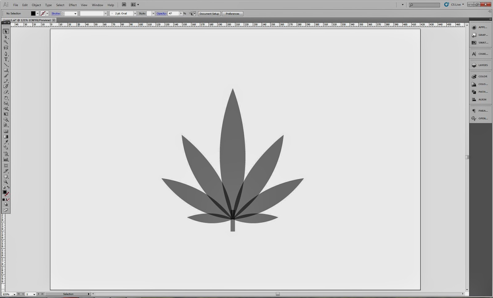
I started the process by first creating a vector image of a cannabis leaf.
The logo displayed below is really successful due to the balance that the composition achieves between the coloured icon and supporting typography.
A simple two colour version was also created.
REFINEMENT
After creating the initial range of logo designs I decided to refine the selection of outcomes in preparation for sending the range to the clinet. In past projects I have had much more success when presenting clients with a limited selection of logos rather than every variation produced.
REFINED LOGO SELECTION;
CLIENT CONTACT
Once I had refined the selection of logos I contacted the client via Facebook and sent him images of the various outcomes. The client was very happy with the outcomes and was prepared to make his final selection from the variations sent.
The conversation below documents the interaction;
SELECTED LOGOS;
After discussing the logos with the client and explaining how certain variations form a set with others the client made a selection of three final logos.
The logo choices displayed below;
DISSEMINATION
After the client had outlined the logos they liked and paid the money into my bank account I sent him a pack containing the various logo files.
The pack was uploaded to Dropbox where a private link allowed the client to have access to the various files.


No comments:
Post a Comment