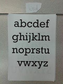
In
today’s seminar, Fred introduced us to the anatomy of type.
We
first were introduced to the different materials used to generate type, some of
the materials are old and have been used for centuries, others are new
production techniques that have been introduced to the design industry in the
last twenty years.
Stone
Sable
Bone
Wood
Lead
Silicone
Next
we looked at the dictionary definition of typography to give us a clear
understanding of the word.
ty·pog·ra·phy/ tīˈpägrəfē/
Noun:
|
|
|
Synonyms:
|
Printing
|
|
After
this we were split into groups, we had previously been set a task to collect
examples of five alphabets, each with a different characteristic. The task
required us to sort the fonts into five groups defined by type characteristic.
We had to think of the defining characteristics of each font, this formed our
five groups that were;
Serif
Sans
Serif
Bold
Light
Script
Upon
completing this, each group had to read out how they had categorised their
fonts, this formed a large group list of type characteristics;
Calligraphy
Script
Basic
Block
Modern
Roman
Classical
Bold
Cropped
Archaic
Retro
Futuristic
Divided
Free
Ridged
Rounded
Playful
With
this list we have a range of visual references and ways to define and describe
text.
Next,
we were requested to rearrange our letterforms into groups that we believed to
be their origin, using the list of production methods as reference. Due to the crossovers between type style and
production method this was a hard task, as methods such as wood and lead
production share many of the same fonts.
Finally, we were handed an informative sheet that shows and explains different terms, and rules that are used within typography.
Finally, we were handed an informative sheet that shows and explains different terms, and rules that are used within typography.
Finally,
at the end of the session we received some additional work. We swapped our five
fonts that we previously collected, with the person sat on our left. The task
required us to identify the five typefaces using our new knowledge of type characteristics
to help us. Additionally, we then had to collect detailed research on one of
the fonts.
FONT 1 - GILL SANS
FONT 2 - AG BOOK BQ
Designer: Günter Gerhard Lange
Year: 1980
Publisher: Berthold
FONT 3 - VAG rounded black
Designer: Unknown
Year: 1979
Publisher: Adobe
|
FONT 4 - Nimbus Roman
Publisher: URW++
|
FONT 5 - COMPACTA (LETRASET)
Designer: Fred Lambert
Year: 1963
Publisher: Letraset
Influence on:
Despite the outcomes of the website, I believe some fonts are wrong, such as Compacta. I think that this font shares more similarities with the bold display font 'Impact', due to the letter width.
Moreover, we had to select one
font that we would then research into further. I chose to research into Gill
Sans.
Gill sans is an adaptation of a
font called ‘Johnston Sans’ originally designed by Edward Johnston. Eric Gill was
Johnston’s apprentice at the time and helped create the iconic typeface that
was designed for the London Underground. However, Gill was not happy with the finished
typeface, claiming that some letters could be more legible. Therefore, Gill produced
a new font that used Johnstons original as a base font.
When finished the typeface became
increasingly popular, in 1929 it became the standard typeface for the London
North Eastern Railway and was used on the trains as well as for signage. The usage
and popularity continued to grow and the font can now be found being used on corporate
branding, on book covers and posters.


No comments:
Post a Comment