Thursday, 25 October 2012

PRINT WORKSHOP


Today we attended a print workshop, the aim of which was to introduce us to different printing techniques and let us experiment with them. There were three different types of printing that we could try-out ; letter press, lino cut prints and mono-printing. As we only had a certain amount of time, I first chose to experiment with a printing technique I had never worked with, letterpress.


Firstly, I searched through the boxes of type to find fonts that work with each other. Once I had found the letters I needed I planned out my composition and inked up the letters. I produced two prints, both have no relevance to my current work as they are experimental prints. Once I had finished using a letter it had to be cleaned, this had to be done a special way to make sure all think excess ink is removed. Firstly, you apply oil to a cloth, using this you clean the letter. Then using a mixture of washing up liquid and water you clean the letter once more, removing any oil or ink that had been missed.  As there was a large group we had to hand press the letters, this caused some letters to lose clarity due to a lack of pressure.  


After producing my two letterpress prints I moved on to the next printing station. Here, I worked with the lino cut printing technique to reproduce a letterform that I created for the alphabet soup – visual thinking brief. The typeface is based on sound waves, so there was a lot of curved lines that were difficult to recreate accurately using the gouge. Due to the difficulty of creating a waved line the print didn’t turn out exactly how I wanted it, to look like the original there needed to be a greater quantity of lines and they needed to be more fluid. Finally, after producing the first print there was still ink on the plate, therefore, I printed it a second time which resulted in a subtle grey outcome. Although linocut printing is a useful technique it is only suitable for certain pieces. 


Tuesday, 23 October 2012

ALPHABET SOUP - WEEKEND EXERCISE


After our studio de-brief we where asked to create a logo design made from the typeface we created for our partners. The exercises aim was to make us consider in what context our typeface could be used.

My typeface was very illustrative, and used a mixture of collage and illustration to create letterform, and portray my partner’s personality. Therefore, the content of the illustration would have to be relevant to the company or business I am trying to portray. When searching for a company to represent I had to consider how the content of my alphabet would accurately portray the company ethos.

My typeface predominantly revolves around dancing and movement, so I started researching into photographers that specialised in ballet photography. After conducing some research into this I discovered Lois Greenfields work. Specialising in dance and Ballet photography she seemed perfect to represent with my typeface.  

I produced a mock up of the design in photoshop. However, we were told that the piece had to be produced by hand.


It was producing the design by hand were I encountered some problems. As I was creating the design at a small size it was hard to capture all the detail of the letters design. Moreover, as the letterforms are quite complicated it was hard to reproduce accurately.


Monday, 22 October 2012

ALPHABET SOUP - ILLUSTRATOR

ALPHABET SOUP - ILLUSTRATOR


This brief requires me to produce an alphabet from the letterforms I produced in response to the word I pulled out of the randomiser. Using illustrator we are going to digitally produce a full alphabet from the letterforms. To help us learn how the program works we do weekly illustrator workshop sessions with Simon, who tells us about different techniques and tips. 

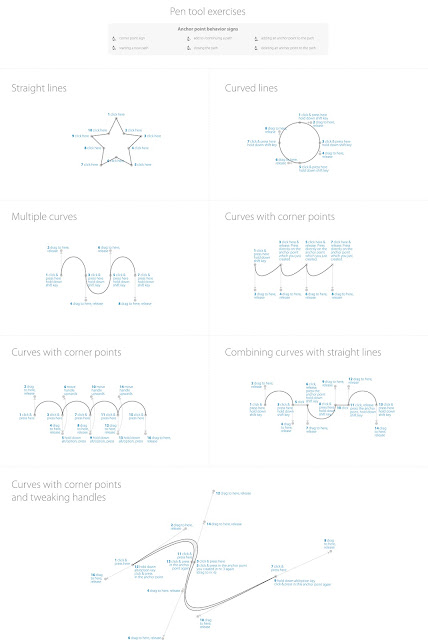
Pen tool exercise

 Task one asked us to complete different pen tool exercises, each one made us test a different technique. The exercises started off at quite an easy level and progressed gradually getting harder. I have previously worked with illustrator so completing the sheet wasn’t challenging.


Vector letterform exercise


Next, Simon presented us with a quick sketch of the letter G that he had produced before the session. Using the skills we had just learned we had to produce a vector version of the letter.


After creating my vector versions of the letterform using the pen tool we then had to adjust and refine our letterform using the direct selection tool. With this tool you can readjust points of your letterform or illustration, which is very useful when you need to make changes to your work.


Pathfinder exercise


In our next sessions the first exercise focused on using the pathfinder tool, we had to reproduce the ‘G’ letterform that we looked at last week. Pathfinder is a handy tool that allows you to combine, subtract and divide paths and shapes, allowing you to save a lot of time. I found using the pathfinder tool much easier and more convenient than just using the pen tool.


Manipulating existing type exercise


After experimenting with the pathfinder tool Simon moved on to talk about how to manipulate and adapt existing typefaces, something that happens regularly in the design world. First I converted my chosen typeface into outlines, which then enabled me to adjust the points of each letter. Using the direct selection tool I could then adjust points of the typeface, this technique enables designers to create new typefaces from a base font.


Stroke Exercise


In this exercise we learned to adjust the width of strokes using the width tool, this technique is really useful when producing illustration work.  You can use the tool to adjust the width of individual lines or shapes. Moreover, you can also choose the type of width profile, which essentially changes the shape of the width of the line. Examples can be seen below


Blend exercise


In this exercise we looked at the blend tool, the blend tool takes two shapes and blends them into each other using a range of different techniques. The tool gives you control of how many steps this change takes place in, and the option to change it to a colour gradient. Below is my experimentation with the tool.


In todays session we used the skills that we have learnt in the last few workshops to start digitally producing our alphabet. We were left to our own devices, and had to decide what technique would work best when recreating our alphabets.

Scanned in letters from my alphabet. 


My alphabet portrays sound waves, through a mixture of straight and waved lines.  Therefore, it uses a lot of intricate lines, because of this I believe the best way to reproduce my alphabet is to use the pen tool.


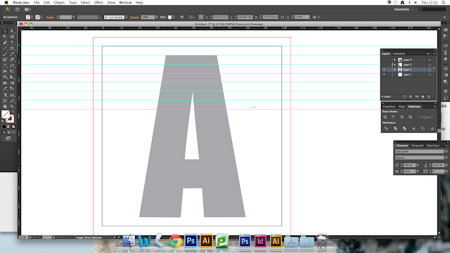
I decided against scanning in my letterforms to work from as the lines are quite compressed, so it would have been hard to follow when replicating each letter. Instead, I downloaded ‘Gabo Drive’ the same typeface that I used as a base when creating the type. I want the lines that run off each letter to meet when used at a typeface. Therefore I set guides up to help me accurately place each one. I then started re-creating my typeface digitally, images of this process can be seen below.  


Setting up the guides.


I used the pen tool to form the waved lines.


Finished letter A.


I used the same technique when producing the second letter, using the same guides to ensure the letter lines would meet up when used as a font. However, when I placed the two completed letters together I encountered a problem.

Finished letter B


The image above shows my first two digital letters placed next to each other. As you can see the lines of the letters do not match up despite using the same guides when producing the letter B. I am not sure why the lines do not match up; however, I need to reconsider my method of production. I will experiment with new ways creating the letters so when used as a font the lines match up. 


To overcome the problem I encountered with the lines not matching up I decided to create the letters in one continuous line. I created a document in Photoshop that measured 10cm x 260cm.


I set up guides marking the start and finish of each letters space. Moreover, I set up horizontal guides for each line to run along.


Before I started producing my alphabet I had to change the form of some letters, such as the ‘S’ which needed the beak of the letter adjusting so that it was flat. Without this modification my method of production would not work.


I then started producing my alphabet, using the guides I created lines that completed a small section of every letter, this process was repeated, each time forming a new line, until the letters were complete. For this image a removed the guides so the whole letterform can be seen properly.


As you can see, the letterforms are slightly illegible due to there being no definable edge to each letter.  Therefore, to make my alphabet more readable, I decided to add an outline edge to each letter. 


As soon as the edge was added the letters instantly became more legible.


Below are images of the completed letterforms.


To create the finished alphabet I had to cut up my line of letters, making each letter individual. To do this I first created a document in Photoshop, with the same dimensions as my first. I had to rasterise my vectors as I was unable to separate the letterforms without doing this. I then used the rectangular marquee tool to select each letter.


I created a new CYMK document that measured 10x10cm and then placed each individual letterform in it. Therefor, I had a document with all of the individual letters ready for composing my A1 outcome. 


To create my A1 poster I first laid out my individual letterforms in rows of four. Making sure that they where all in line and evenly spaced. I continued this until all the letters had been done, due to the number of letters in an alphabet there were two letterforms left over, this was intentional. I plan to fill the negative space with information regarding the brief, content and outcome of my alphabet.


I used guides to help me accurately position my rectangle.


The aim of the information I am including on the poster is to give the audience a short insight into the brief, and design choices that were made. It was mentioned in one of the group criticisms that the concept of the poster was hard to immediately understand. Therefore, I have included relevant information to help confused viewers understand the concept. Not only does this help the audience, but it also gives viewers a greater understanding of the project enabling them to criticise the work on a deeper level. 


With my individual letterforms I also wanted to make a working typeface. I used a font program called ‘Fontographer 5’ to create it. I had no experience working with this software, so creating the typeface enabled me to experiment with the program and its functions.

First, upon opening the program you are greeted by a window displaying all the glyphs beloning to a complete font. If I was creating a complete font I would need letterforms for each of these glyphs. When I selected the first letter a new window poped up, this is where you create your letterform. 


This is where I faced my first problem, Fontographer wouldn’t let me open my letterforms straight out of Photoshop. I had previously converted them as Photoshop EPS. files, as in the import section of the program EPS. files were an option for importing. I specifically changed them so the program would be able to open them however it did not.

I overcame this problem by directly pasting my letterforms onto the template later on Fontographer.

I then found the auto-trace tool, you can use this to trace the lines of your letterform. Using this tool i created my letterforms.


I then continued to repeat this technique for each letter of my alphabet.


I continued using the same technique to create each letterform, there were no problems until I reached the letter ‘E’. This is where I encountered my second problem, the auto-trace tool would not trace the template because the paths were too complicated. I tried to resolve the problem but due to my lack of knowledge of the program and tightness of time I had to move on.  


I used the metric window to test the kerning and size of each letterform, doing this enabled me to see imperfections and parts of the font that needed adjusting. I found that a lot of the lines did not match up with the letter next to it, this was one of my main aims of the typeface and vital to its visual quality. I started tediously adjusting points of each letterform to try and achieve a higher degree of accuracy.


Moreover, I faced another problem when some paths developed sections of block colour after auto-tracing. This was another problem I could not overcome due to my lack of experience with the program.


Finally, after completing the letterforms that Fontographer would auto-trace, I decided to place ‘A’ and ‘X’ together to see how accurately the font was aligned. When in profile I noticed that the alignment of the two letters was poor.


To conclude, I attempted to create a working typeface using the program Fontographer 5. I encountered many problems while I tried to create the font, and due to a lack of knowledge of the program these problems could not be overcame. This resulted with the incompletion of the typeface. I want to continue experimenting with this program and improve my knowledge of how it works.


FINALS