COMPETITION INFORMATION
Before I started collecting research or generating ideas in response to the brief I decided to go to the official competition webpage to review the brief and the submission details. Unlike a lot of other briefs that I have reviewed the 'UnReported' one was very well written and goes through important information in great detail.

- Brief asks participants to create a protest to raise awareness of 'The Arctic 30' campaign.
- Peaceful protest can bring about change...creativity is nessecary to engage with different audiences - this statement relevant to my personal beliefs and gives the brief more meaning and importance.
- Outcome can take on a variety of forms from sculpture to animation.
- Protests must be able to be viewed online.
- A 'Viral Bonus' is awarded to the first competition entry that 'goes viral' - starts gaining popularity/attention online.
- 'Going Viral' is defined by reaching more than 5000 views within the seven day period and rewards and efforts for the promotion and dissemination of the protest.

Submissions will be judged by a panel on the following;
- Originality - outcome aims to push the boundaries of how multimedia and creative arts can be applied to spread messages.
- Content - Outcome engages issues relevant to the campaign.
- Accessibility - The protest is accessible to an international audience.
Limitations;
- Submissions must not be inflammatory or discriminatory.
- All submissions will be assessed prior to publishing any work that is seen to be inflammatory or discriminatory will not be published.
- Authors take full responsibility for copyrighting, referencing and obtaining necessary permissions.
Submission criteria;
- Submissions may be individual or collaborative.
- Authors must submit only one entry.
- Works do not need to be newly created but authors should ensure the meet all criteria.
- Registration can take place any time before the competition deadline.

- Authors can nickname themselves to protect their identities.
- After registering submit completed protests to protest@unreported.com.
- Files must be submitted as either MOV (max 1 min length) and JPEG (200MB max).
- The file name should be 'File name: FreeTheArcticThirty_yournickname.jpeg/.mov
- Include a brief synopsis (150 words max) of the submission.
- Submissions can be made in any language but a translation must be provided in English.
RE-WRITING THE BRIEF
After reading through and assessing the competition information available on the 'unReported' website I decided to re-write the brief to ensure that I approach it from an individual perspective and create an original outcome.

THE BRIEF;
Create a form of protest to capture the attention of the general public and raise awareness of the current situation involving the Greenpeace 'Arctic Thirty'.
CONCEPT;
Create a printed form of protest that can be distributed globally to help raise public awareness of the 'Arctic Thirty' campaign.
BACKGROUND;
The 'Arctic Thirty' are a collection of environmental activists aboard the Greenpeace ship 'The Arctic Sunrise'. While taking part in a peaceful protest at Gazprom's oil rig the thirty activists were arrested at gun point by Russian special forces and imprisoned in Russia. In light of the incident Greenpeace have launched a campaign to raise public awareness of the arctic thirty situation in hope that international public interest will help to ensure their release.
TARGET AUDIENCE;
The target audience needs to be as wide as possible as the success of the outcome relies on its ability to raise public awareness of the Greenpeace campaign.
TONE OF VOICE;
Formal & Informative
CONSIDERATIONS;
- How will the outcome capture the audiences attention?
- How will the outcome visually represent the campaign?
- How will the outcome evoke a reaction from members of the audience?
- Where will the protest be displayed?
- Will the protest be legal?
MANDATORY REQUIREMENTS;
- 150 word synopsis.
- Printed protest piece submitted online.
- Project design boards (module submission).
DELIVERABLES;
- Printed protest piece.
RESEARCH
Once I had re-written the brief I was in a position to start collecting a body of research to help me create an informed and relevant outcome in response to the brief. The link below navigates to my research blog post on my design context blog.
General research - Research Link
Reference images - Research Link
IDEAS GENERATION
After completing my research I felt like I understood the campaign and what the judges will be looking for in a successful submission. Therefore, I started the process of generating a range ideas through the use of spider diagrams which are displayed below.
In the first diagram I focused on

Using the previous diagram as a means of inspiration I next created a map exploring some initial ideas for the project.

Main ideas;
- Greenpeace bird breaking out of cage - poster.
- Chained polar bear - paste-up artwork (street art).
- Arctic Thirty portraits - poster.
FINAL IDEA
From the selection of refined ideas generated by the spider diagrams I outlined three main ideas, from these final three I selected the concept I wanted to develop. Before selecting my choice I reviewed the ideas assessing their relevance to the brief, campaign and how effective the piece of communication could be. Assessing the applicability of the ideas allowed me to select and develop the most effective outcome.
CHOSEN IDEA;

IMPRISONED POLAR BEAR
- Largely image based communication makes the outcome suitable for a global audience.
- The protest style outcome has relevance to the brief as the outcome will take the form of a street art style paste up piece.
- The shocking nature of the outcome will provoke audience reaction and engage them with the campaign.
PHOTOGRAPHY
After outlining my final idea and deciding that it will be produced it digitally I was ready to start to process of creation, this process was started by taking the photograph on which the illustration will be placed once complete.
Within my image I wanted to capture more than just a plain brick wall to ensure that the outcome is interesting, realistic and visually engaging. I believe that photographing a scene with features typically found within a city environment will give the outcome context as to where it would be found in reality.

DESIGN DECISIONS
Next, before progressing with the project and creating my illustration I first had to define the relevant design decisions such as the colour scheme. As the outcome will be submitted digitally and predominantly rely on imagery to communicate its message design decisions relating to typefaces and stock need not be considered.
COLOUR SCHEME;
The image below illustrates the colour scheme that will be digitally applied to the illustration once complete. When selecting the colours I wanted to capture an essence of the arctic to give the piece another aspect of relevance to the campaign. Therefore, I chose an assortment of colours ranging from a light grey, a selection of pale blues and deep dark navy, these are all colours that seem to dominate the arctic landscape and so hold relevance to my outcome.
As the outcome is being designed for printed purposes I ensured that the colors were selected from a CMYK colour mode.

INITIAL DESIGNS
Once I had finalised my concept I was in a position to start producing some rough initial sketches to explore different compositions. As I am working to a tight timescale I have decided to only produce a selection of initial designs to ensure that I move through the project at the appropriate pace.
When creating the designs I used some polar bear images taken from my reference image research to ensure that I could quickly illustrate a selection of designs.
Reference images - Research Link


FINAL ILLUSTRATION
After creating a range of initial designs I selected my favorite initial design and created the final illustration. The image below displays the outcome.

DIGITAL PRODUCTION
Once I had finalised the base illustration I scanned the image in at 300dpi and imported the document to Adobe illustrator. Once in illustrator I vectorised the illustration using the 'live trace' option ready for the coloring process.


DISPLACEMENT MAP
After colouring the illustration the polar bear was ready for placing onto the photograph however, before doing so I applied a displacement map to the image to replicate the faint creases commonly found on paste-up artwork. The application of the displacement map is an important aspect of the production process as it makes the outcome look more realistic and convincing.
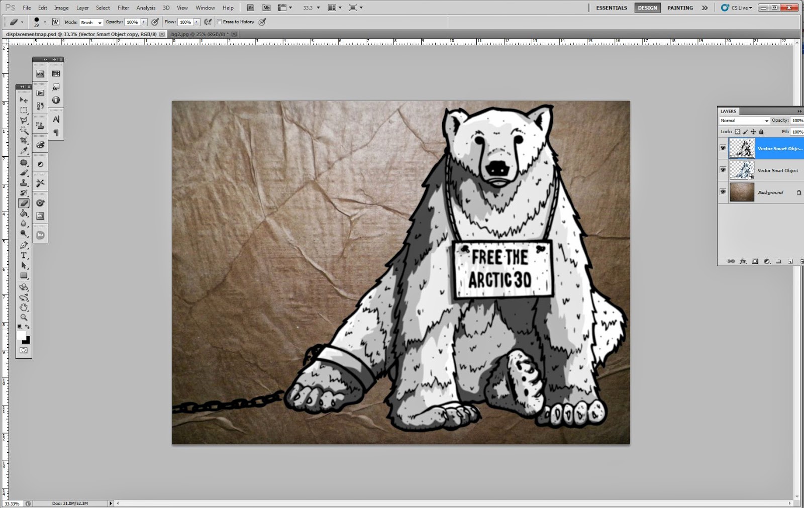

DISPLACEMENT MAP TWO
After applying the first displacement map to the illustration the outcome was ready for placing onto the photograph. However, after placing the image onto the photograph I realised that the outcome still didn't achieve the level of realism I was hoping to achieve. To overcome this problem I applied another displacement map to the illustration to highlight some of the walls texture.


SHADOWS & HIGHLIGHTS
Finally, once the second Displacement Map had been applied the illustration looked much more convincing but was still lacking the shadows and highlights needed to complete it. I finished off the digital production process by adding a faint drop shadow to slightly lift the piece from the wall while also adding a black overlay with adjusted opacity to replicate shaded areas.

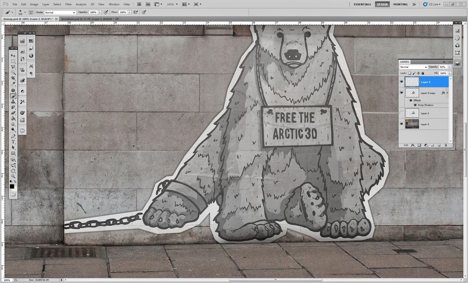


FINAL OUTCOME
Below is an image displaying my response to the brief;


SYNOPSIS
For the submission my image needs a 150 word synopsis to summarise my concept, below is the body of text that I will submit with my image when entering the competition.
The final word count came to 144 words.

FINAL SYNOPSES
Firstly, the outcome created in response to the brief aims
to capture the public’s attention and raise awareness of the Arctic Thirty
campaign. To achieve this, a printed form of protest has been created which
would be produced, distributed and pasted-up onto walls in a similar fashion to
a paste-up advertisement. Due to the nature of the outcomes production and
dissemination the protest could be distributed to campaign representatives
worldwide and displayed in a number of different countries to further extend
the campaigns impact. Additionally, to
capture the public’s attention and engage them with the Greenpeace campaign the
outcome features a thought provoking illustration of an imprisoned polar bear with
accompanying ‘Free the Arctic Thirty’ signage. The polar bear was chosen as a representative
for the campaign as it is both an ambassador of the Arctic and the Greenpeace
crew.
REGISTRATION
Below are images documenting the registration process on the 'unREPORTED' website. Once registered I was able to submit my outcome to the email address provided by the brief.


SUBMISSION DETAILS
Before submitting my project I briefly checked over the submission details and the terms and conditions of entry to ensure that there would be no problems when submitting my response.

SUBMISSION
Before submitting my project I briefly checked over the submission details and the terms and conditions of entry to ensure that there would be no problems when submitting my response.
SUBMISSION
After re-checking the submission details I felt confident my design complied with all the competition rules and regulations. Therefore, I placed a JPEG image of my outcome with the accompanying synopsis into an email and submitted to the competition.