Wednesday, 30 April 2014

DESIGN PRACTICE 2 - STUDIO BRIEF 2 - SESSION 2

At the start of the session we were tasked with creating a list of things we do not know, or want to know about our OUGD505 project. 

The image below displays the list created in class;


LIST;

  • Where will the product be distributed from?
  • Who is the target audience?
  • Will I photograph the outcome with the book created for brief 2?
  • What do I have time to produce?

Once we had finished creating our lists Lorraine went round the room asking people to read out a point relevant to something they want to know about 505. From the points that were discussed Lorraine comprised a class list of the most important aspects;

CLASS LIST;
  • Target audience - Narrow down and focus.
  • Final full range of products.
  • Figure out what problems you are solving.

After discussing the three points of the class list we reviewed our current briefs for the project and underlined the aspects that we believed were the most important parts of the initial brief. 

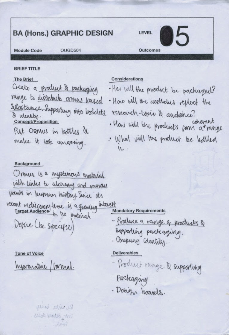
The image below shows my initial brief;


IMPORTANT PARTS OF THE BRIEF;
  • The bottles containing the ORMUS.
  • Packaging containing the bottles.
  • Where the product would be distributed.
  • How it would be displayed.
  • The information supporting the product - back story.
  • Links to alchemy - back story.
  • Tone of voice - informative/serious. 
  • Audience. 


After completing the task Lorraine reminded us that the briefs should be simple yet informative with the way project information is communicated. Therefore, for the next task we went back through the brief and analysed its contents crossing out areas that were not relevant or could be improved.


Next, we reviewed analysed brief and used its contents to help us create a new refined version.

The re-written project brief is displayed below;


Finally, after writing the new, refined project brief we created an action plan to help us progress from the points covered throughout the sessions duration. When creating my action plan I used the list created at the start of the session to help me create a plan relevant to the progression of my outcome. 


ACTION PLAN;
  • Analyse the primary store research collected last week to help me define a distribution point.
  • Define a primary target audience.
  • Create a project time sheet to help me assess how much work I can produce.

Tuesday, 29 April 2014

DESIGN PRACTICE 2 - STUDIO BRIEF 2 - CRITICISM

Upon returning from the Easter holidays one of the first things we did was complete a class criticism of everyone's current progression with Studio Brief Three. 

Unfortunately, I had not checked eStudio that morning and so did not know the criticism was going to take place, because of this I only had a limited amount of visuals to present which affected the relevance of the feedback received. 


The image below displays the range of A4 sheets presented;


Moreover, the image below displays the feedback I received form the session. 


MAIN POINTS;
  • New packaging poreffered. 
  • Add lid to design.
  • New packaging will be easier to craft and print onto.
  • New packaging fits with the design better than previous idea.
  • Lid will help to secure items in place.


ONE-ON-ONE CRITICISM

As I was so unprepared for the criticism I spoke to Lorraine who informed me that there was a period of time the next day for one-on-one student and tutor criticisms. Therefore, I decided to arrange my project elements and utilise the one-on-one time to receive informed feedback on my projects development.

Below is a picture of some of the items presented.


ITEM LIST;

  • Bottle range.
  • Development sheets. 
  • Inspiration sheet - taken from research.

During the critique I had time to talk through the project and explain the individual choices made and how they have relevance to the project and research area. After I had finished talking through the project Lorraine gave me some feedback which is documented below.


FEEDBACK


MAIN POINTS;
  • Product scope - Where would the product be sold? - shop should reflect product.
  • In-store Branding - consider in store branding, shelving, product delivery - how will these decisions reflect the outcome?
  • Online presence - Website and social media campaign to support & promote the product.
  • Product aesthetic comes across as male due to the dark masculine colour pallet - this actually reflects the nature of the product.
  • Synopsis tag - will help users understand the product and its history. 


After reviewing and analysing the feedback received from the one-on-one critique with Lorraine I formed a list of responses to help the project progress from the criticism. 


RESPONSES 
  • Collect primary research into possible store locations.
  • Collect primary research reviewing the in-store branding of existing products.
  • Assess project timescale and consider producing an online campaign. 
  • Explore synopsis tag in more detail. 

Thursday, 24 April 2014

DESIGN PRACTICE 2 - STUDIO BRIEF 1 - FINAL IMAGES

Once I had finished the production of the booklet I set up a D.I.Y photography studio to take a final set of images of the booklet. I am really happy with the final outcome and the quality of production applied to make it. Therefore, I wanted a set of images to use in my portfolio that showcase the projects outcome. 

To keep the booklet open during the photography process I created the contraption displayed below.


 The D.I.Y studio.


FINAL IMAGES

The final set of images showcasing the booklet can be seen below.